今日作业
1 | |
Day06 作业布置
一. 完成课堂所有的代码
盒子模型
08-盒子模型-margin
1
2
3
4
5
6
7
8
9
10
11
12
13
14
15
16
17
18
19
20
21
22
23
24
25
26
27
28
29
30
31
32
33
34
35
36
37
38
39
40
41<!DOCTYPE html>
<html lang="en">
<head>
<meta charset="UTF-8" />
<meta http-equiv="X-UA-Compatible" content="IE=edge" />
<meta name="viewport" content="width=device-width, initial-scale=1.0" />
<title>Document</title>
<style>
/* 外边距margin:上右下左,一般用于兄弟元素之间的距离 */
/* padding一般用于父子元素之间的间距 */
/* 用inline-block会出现中间一条线(因为换行符),还会出现上下不齐 */
body {
/* 解决inline-block问题 */
font-size: 0;
}
.one {
display: inline-block;
width: 300px;
height: 300px;
background-color: pink;
/* 一个值:上下左右 */
/* margin: 30px; */
/* 两个值:上下 左右 */
/* margin: 10px 30px; */
/* 三个值 上 左右 下 */
margin: 10px 20px 30px;
}
.two {
display: inline-block;
width: 200px;
height: 200px;
background-color: #f00;
}
</style>
</head>
<body>
<div class="one">我是第一个</div>
<div class="two">我是第二个</div>
</body>
</html>09-盒子模型-padding和margin对比
1
2
3
4
5
6
7
8
9
10
11
12
13
14
15
16
17
18
19
20
21
22
23
24
25
26
27
28
29
30
31
32
33
34
35
36
37
38
39<!DOCTYPE html>
<html lang="en">
<head>
<meta charset="UTF-8" />
<meta http-equiv="X-UA-Compatible" content="IE=edge" />
<meta name="viewport" content="width=device-width, initial-scale=1.0" />
<title>Document</title>
<style>
/* 需求:子元素距离父元素左侧/上侧有一定的距离 */
/* 父子之间的距离用padding,兄弟之间的间距用margin */
.box {
width: 500px;
height: 500px;
background-color: pink;
/* 方式一:给父加padding,但是盒子会撑大,通过box-sizing */
/* padding: 20px 0 0 30px;
box-sizing: border-box; */
/* 解决传递问题 */
overflow: auto;
}
.son {
width: 200px;
height: 200px;
color: #fff;
background-color: red;
/* 方式二,给子元素加margin */
margin-left: 20px;
/* 造成margin-top的传递 */
margin-top: 20px;
}
</style>
</head>
<body>
<div class="box">
<div class="son">我是子元素</div>
</div>
</body>
</html>10-盒子模型-margin的传递
1
2
3
4
5
6
7
8
9
10
11
12
13
14
15
16
17
18
19
20
21
22
23
24
25
26
27
28
29
30
31
32
33
34
35
36
37
38<!DOCTYPE html>
<html lang="en">
<head>
<meta charset="UTF-8" />
<meta http-equiv="X-UA-Compatible" content="IE=edge" />
<meta name="viewport" content="width=device-width, initial-scale=1.0" />
<title>Document</title>
<style>
/* 上下margin的传递 */
.father {
width: 400px;
height: 400px;
background-color: red;
/* 解决方式一 */
/* border: 1px solid rgba(0, 0, 0, 0); */
/* 方法二 */
/* overflow: auto; */
/* 方法三 加padding */
padding: 20px 0 0 0;
}
.son {
width: 200px;
height: 200px;
background-color: pink;
/* 当子元素(块)的顶线和父元素的顶部线重叠了,那子元素的margin-top传递给父元素 */
margin-top: 30px;
/* 左右不会传递 */
margin-left: 10px;
}
</style>
</head>
<body>
<div class="father">
<div class="son">我是子元素</div>
</div>
</body>
</html>11-盒子模型-margin-bottom的传递
1
2
3
4
5
6
7
8
9
10
11
12
13
14
15
16
17
18
19
20
21
22
23
24
25
26
27
28
29
30
31
32<!DOCTYPE html>
<html lang="en">
<head>
<meta charset="UTF-8" />
<meta http-equiv="X-UA-Compatible" content="IE=edge" />
<meta name="viewport" content="width=device-width, initial-scale=1.0" />
<title>Document</title>
<style>
.father {
width: 400px;
height: auto;
background-color: red;
overflow: auto;
}
.son {
width: 200px;
height: 200px;
background-color: pink;
/* 当父元素的底线和子元素(块)的底线重叠时,并且父的height:auto,
那就会造成margin-bottom传递 */
margin-bottom: 20px;
}
</style>
</head>
<body>
<div class="father">
<div class="son">我是子元素</div>
</div>
<div>今天愚人节</div>
</body>
</html>12-盒子模型-margin的折叠
1
2
3
4
5
6
7
8
9
10
11
12
13
14
15
16
17
18
19
20
21
22
23
24
25
26
27
28
29
30
31<!DOCTYPE html>
<html lang="en">
<head>
<meta charset="UTF-8" />
<meta http-equiv="X-UA-Compatible" content="IE=edge" />
<meta name="viewport" content="width=device-width, initial-scale=1.0" />
<title>Document</title>
<style>
.one {
width: 400px;
height: 400px;
background-color: red;
/* 上下兄弟的折叠 ,取较大值*/
/* 折叠就是垂直方向的兄弟元素,一个设置margin-bottom,一个设置margin-top,最后合并一个margin */
margin-bottom: 30px;
}
.two {
width: 200px;
height: 200px;
background-color: pink;
margin-top: 50px;
/* 水平margin不折叠 */
}
</style>
</head>
<body>
<div class="one">大哥</div>
<div class="two">二弟</div>
</body>
</html>13-盒子模型-margin的折叠 父子之间
1
2
3
4
5
6
7
8
9
10
11
12
13
14
15
16
17
18
19
20
21
22
23
24
25
26
27
28
29
30
31
32
33<!DOCTYPE html>
<html lang="en">
<head>
<meta charset="UTF-8" />
<meta http-equiv="X-UA-Compatible" content="IE=edge" />
<meta name="viewport" content="width=device-width, initial-scale=1.0" />
<title>Document</title>
<style>
.one {
width: 400px;
height: 400px;
background-color: red;
/* 父子块的折叠 ,取较大值*/
/* overflow: auto; */
margin-top: 30px;
}
.two {
width: 200px;
height: 200px;
background-color: pink;
margin-top: 50px;
/* 水平margin不折叠 */
}
</style>
</head>
<body>
<div>红红火火恍恍惚惚或或或或或或或或或</div>
<div class="one">
<div class="two">二弟</div>
</div>
</body>
</html>14-块级水平居中问题
1
2
3
4
5
6
7
8
9
10
11
12
13
14
15
16
17
18
19
20
21
22
23
24
25
26
27
28
29
30
31
32<!DOCTYPE html>
<html lang="en">
<head>
<meta charset="UTF-8" />
<meta http-equiv="X-UA-Compatible" content="IE=edge" />
<meta name="viewport" content="width=device-width, initial-scale=1.0" />
<title>Document</title>
<style>
.one {
width: 800px;
height: 300px;
background-color: red;
text-align: center;
}
.two {
width: 200px;
height: 200px;
background-color: pink;
/* 水平居中方式一 */
/* margin: 0 auto; */
/* 方式二 */
display: inline-block;
}
</style>
</head>
<body>
<div class="one">
<div class="two">二弟</div>
</div>
</body>
</html>15-外轮廓
1
2
3
4
5
6
7
8
9
10
11
12
13
14
15
16
17
18
19
20
21
22
23
24
25
26
27
28
29
30
31
32<!DOCTYPE html>
<html lang="en">
<head>
<meta charset="UTF-8" />
<meta http-equiv="X-UA-Compatible" content="IE=edge" />
<meta name="viewport" content="width=device-width, initial-scale=1.0" />
<title>Document</title>
<style>
.box {
width: 300px;
height: 300px;
background-color: pink;
/* 外轮廓不占位置,和border设置一样 */
outline: 20px solid rgba(111, 59, 59, 0.8);
}
/* 给a设置样式,相当于给a的所有动态伪类都设置了 */
a,
input {
/* 通常给a和input去掉外轮廓 */
outline: none;
}
</style>
</head>
<body>
<div class="box">外轮廓</div>
<div>我是块</div>
<span>hhhhhhhh</span>
<a href="#">百度一下</a>
<input type="text" />
</body>
</html>16-盒子阴影
1
2
3
4
5
6
7
8
9
10
11
12
13
14
15
16
17
18
19
20
21
22
23<!DOCTYPE html>
<html lang="en">
<head>
<meta charset="UTF-8" />
<meta http-equiv="X-UA-Compatible" content="IE=edge" />
<meta name="viewport" content="width=device-width, initial-scale=1.0" />
<title>Document</title>
<style>
.box {
width: 300px;
height: 300px;
background-color: pink;
margin: 50px auto;
/* box-shadow:offset-x offset-y blue-radius spread-radius color inset; */
box-shadow: 20px 30px 5px 4px red inset, 100px 50px 4px 3px green;
}
</style>
</head>
<body>
<div class="box">外轮廓</div>
</body>
</html>17-文字阴影
1
2
3
4
5
6
7
8
9
10
11
12
13
14
15
16
17
18
19<!DOCTYPE html>
<html lang="en">
<head>
<meta charset="UTF-8" />
<meta http-equiv="X-UA-Compatible" content="IE=edge" />
<meta name="viewport" content="width=device-width, initial-scale=1.0" />
<title>Document</title>
<style>
span {
/* 文字阴影和盒子阴影差不多,少了向外延伸半径 和 inset */
text-shadow: 20px 30px 4px blue;
}
</style>
</head>
<body>
<span>文字阴影</span>
</body>
</html>18-行内非替换元素的特殊性
1
2
3
4
5
6
7
8
9
10
11
12
13
14
15
16
17
18
19
20
21
22
23
24
25
26
27
28
29
30
31
32
33<!DOCTYPE html>
<html lang="en">
<head>
<meta charset="UTF-8" />
<meta http-equiv="X-UA-Compatible" content="IE=edge" />
<meta name="viewport" content="width=device-width, initial-scale=1.0" />
<title>Document</title>
<style>
.box {
width: 200px;
height: 200px;
background-color: pink;
}
span {
margin-top: 20px;
margin-bottom: 30px;
padding: 30px 50px;
border: 20px solid #666;
/* 行内非替换元素对width,height,margin上下无效 ,但是对border上下,padding上下有特殊,会撑开盒子,但是不占空间 */
}
</style>
</head>
<body>
<div class="box">11</div>
<a href="#">百度一下</a>
<span>
width、height、margin-top、margin-bottom对行内级非替换元素不起作用</span
>
<a href="#">谷歌</a>
<div class="box">hhhhh</div>
</body>
</html>19-前景色和背景设置的哪些
1
2
3
4
5
6
7
8
9
10
11
12
13
14
15
16
17
18
19
20
21
22
23<!DOCTYPE html>
<html lang="en">
<head>
<meta charset="UTF-8" />
<meta http-equiv="X-UA-Compatible" content="IE=edge" />
<meta name="viewport" content="width=device-width, initial-scale=1.0" />
<title>Document</title>
<style>
.box {
width: 200px;
height: 200px;
background-color: green;
border: 10px solid;
/* 如果没有设置border颜色,那就用color前景色代替 */
color: pink;
}
</style>
</head>
<body>
<div class="box">111</div>
</body>
</html>20-box-sizing
1
2
3
4
5
6
7
8
9
10
11
12
13
14
15
16
17
18
19
20
21
22
23
24
25
26
27
28
29<!DOCTYPE html>
<html lang="en">
<head>
<meta charset="UTF-8" />
<meta http-equiv="X-UA-Compatible" content="IE=edge" />
<meta name="viewport" content="width=device-width, initial-scale=1.0" />
<title>Document</title>
<style>
.box,
.one {
/* content-box:width指的是内容的宽度,盒子实际占据的宽度=width+padding+border padding、border都布置在width、height外边 */
/* border-box:width指的是盒子实际占据的宽度 padding、border都布置在width、height里边,*/
width: 200px;
height: 200px;
background-color: green;
border: 10px solid pink;
padding: 20px;
}
.one {
box-sizing: border-box;
}
</style>
</head>
<body>
<div class="box">111</div>
<div class="one">111</div>
</body>
</html>21-案例新人福利
1
2
3
4
5
6
7
8
9
10
11
12
13
14
15
16
17
18
19
20
21
22
23
24
25
26
27
28
29
30
31
32
33
34
35
36
37
38
39
40
41
42
43
44
45
46
47
48<!DOCTYPE html>
<html lang="en">
<head>
<meta charset="UTF-8" />
<meta http-equiv="X-UA-Compatible" content="IE=edge" />
<meta name="viewport" content="width=device-width, initial-scale=1.0" />
<title>Document</title>
<link rel="stylesheet" href="./css/reset.css" />
<style>
.item {
display: inline-block;
width: 70px;
height: 25px;
text-align: center;
line-height: 25px;
border-radius: 13px;
}
.new {
color: #fff;
background-color: #e1251b;
}
.vip {
color: #e5d790;
background-color: #363634;
}
a:hover {
background-color: #c81623;
color: #fff;
}
</style>
</head>
<body>
<a
href="https://xinren.jd.com/?channel=99#/home"
class="item new"
target="_blank"
>新人福利</a
>
<a
href="https://passport.jd.com/new/login.aspx"
class="item vip"
target="_blank"
>PLUS会员</a
>
</body>
</html>22-模仿小米案例
1
2
3
4
5
6
7
8
9
10
11
12
13
14
15
16
17
18
19
20
21
22
23
24
25
26<!DOCTYPE html>
<html lang="en">
<head>
<meta charset="UTF-8" />
<meta http-equiv="X-UA-Compatible" content="IE=edge" />
<meta name="viewport" content="width=device-width, initial-scale=1.0" />
<link rel="stylesheet" href="css/reset.css" />
<link rel="stylesheet" href="css/xiaomi.css" />
<title>Document</title>
</head>
<body>
<a href="https://www.mi.com/xiaomipad5pro" class="item">
<img src="../image/xiaomi01.webp" class="alblm" />
<h3 class="title">小米平板5 Pro</h3>
<p class="desc">
全新12代英特尔处理器,CNC一体精雕工艺,2.5K
120Hz高清屏,可选MX550独立显卡
</p>
<div class="price">
<span class="old-price">2399元起</span>
<span class="new-price">2499元</span>
</div>
</a>
</body>
</html>23-B站案例
1
2
3
4
5
6
7
8
9
10
11
12
13
14
15
16
17
18
19
20
21
22
23
24
25
26
27
28
29
30
31
32
33
34
35
36
37
38
39
40
41
42
43
44
45
46
47
48
49
50
51
52
53
54
55
56
57
58
59
60
61
62
63
64
65
66
67
68
69
70
71
72
73<!DOCTYPE html>
<html lang="en">
<head>
<meta charset="UTF-8" />
<meta http-equiv="X-UA-Compatible" content="IE=edge" />
<meta name="viewport" content="width=device-width, initial-scale=1.0" />
<title>Document</title>
<link rel="stylesheet" href="./css/reset.css" />
<style>
a {
display: block;
}
.item {
width: 300px;
margin: 100px auto;
}
.item .album img {
width: 100%;
border-radius: 5px;
}
.item .info h3 {
font-size: 15px;
margin-top: 8px;
/* 单行显示省略号 */
/* white-space: nowrap; */
/* 多行显示省略号 */
display: -webkit-box;
-webkit-line-clamp: 2;
-webkit-box-orient: vertical;
overflow: hidden;
text-overflow: ellipsis;
}
.item .anchor {
font-size: 13px;
color: #888;
margin-top: 5px;
}
.item .nickname::before {
content: url(../image/widget-up.svg);
display: inline-block;
width: 16px;
height: 16px;
position: relative;
top: 1px;
margin-right: 8px;
}
</style>
</head>
<body>
<div class="item">
<div class="album">
<a href="#"
><img
src="https://i0.hdslb.com/bfs/archive/9c763bf06b7765462eac62cc0a9a34b260d3f9c8.jpg@672w_378h_1c.webp"
referrerpolicy="no-referrer"
/></a>
</div>
<div class="info">
<a href="#">
<h3>
萌化了!谁会不喜欢毛茸茸的小懒懒呢?萌化了!谁会不喜欢毛茸茸的小懒懒呢?萌化了!谁会不喜欢毛茸茸的小懒懒呢?萌化了!谁会不喜欢毛茸茸的小懒懒呢?
</h3>
</a>
<a href="" class="anchor">
<span class="nickname">Muxi慕喜咩</span>
<span class="time">3-20</span>
</a>
</div>
</div>
</body>
</html>二.CSS-背景
01-背景图片
1
2
3
4
5
6
7
8
9
10
11
12
13
14
15
16
17
18
19
20
21
22<!DOCTYPE html>
<html lang="en">
<head>
<meta charset="UTF-8" />
<meta http-equiv="X-UA-Compatible" content="IE=edge" />
<meta name="viewport" content="width=device-width, initial-scale=1.0" />
<title>Document</title>
<style>
.box {
width: 1000px;
height: 500px;
background-color: pink;
background-image: url(../image/diqiu.jpg), url(../image/lyf.png);
background-repeat: no-repeat;
}
</style>
</head>
<body>
<div class="box">哈哈哈</div>
</body>
</html>02-背景平铺
1
2
3
4
5
6
7
8
9
10
11
12
13
14
15
16
17
18
19
20
21
22
23
24
25<!DOCTYPE html>
<html lang="en">
<head>
<meta charset="UTF-8" />
<meta http-equiv="X-UA-Compatible" content="IE=edge" />
<meta name="viewport" content="width=device-width, initial-scale=1.0" />
<title>Document</title>
<style>
.box {
width: 1000px;
height: 800px;
background-color: pink;
background-image: url(../image/diqiu.jpg);
/* 背景平铺,默认repeat */
background-repeat: no-repeat;
background-repeat: repeat-x;
background-repeat: repeat-y;
}
</style>
</head>
<body>
<div class="box">哈哈哈</div>
</body>
</html>03-背景平铺练习
1
2
3
4
5
6
7
8
9
10
11
12
13
14
15
16
17
18
19
20
21<!DOCTYPE html>
<html lang="en">
<head>
<meta charset="UTF-8" />
<meta http-equiv="X-UA-Compatible" content="IE=edge" />
<meta name="viewport" content="width=device-width, initial-scale=1.0" />
<title>Document</title>
<style>
.box {
width: 300px;
height: 300px;
/* 默认平铺 */
background-image: url(../image/wall.png);
}
</style>
</head>
<body>
<div class="box"></div>
</body>
</html>04-背景位置
1
2
3
4
5
6
7
8
9
10
11
12
13
14
15
16
17
18
19
20
21
22
23
24
25
26
27
28<!DOCTYPE html>
<html lang="en">
<head>
<meta charset="UTF-8" />
<meta http-equiv="X-UA-Compatible" content="IE=edge" />
<meta name="viewport" content="width=device-width, initial-scale=1.0" />
<title>Document</title>
<style>
.box {
width: 1000px;
height: 500px;
background-color: pink;
background-image: url(../image/diqiu.jpg);
background-repeat: no-repeat;
background-position: 20px 60px;
/* 水平方向还可以设值:left、center、right */
/* 垂直方向还可以设值:top、center、bottom */
background-position: left bottom;
/*只设置了1个方向,另一个方向默认是cente*/
background-position: right;
}
</style>
</head>
<body>
<div class="box">哈哈哈</div>
</body>
</html>05-背景尺寸
1
2
3
4
5
6
7
8
9
10
11
12
13
14
15
16
17
18
19
20
21
22
23
24
25
26
27
28
29
30
31
32<!DOCTYPE html>
<html lang="en">
<head>
<meta charset="UTF-8" />
<meta http-equiv="X-UA-Compatible" content="IE=edge" />
<meta name="viewport" content="width=device-width, initial-scale=1.0" />
<title>Document</title>
<style>
.box {
width: 1000px;
height: 500px;
background-color: pink;
background-image: url(../image/diqiu.jpg);
background-repeat: no-repeat;
/* 默认 */
background-size: auto;
/* contain:一边铺满,但是图片保持宽高比 */
background-size: contain;
/* cover 完全覆盖元素,可能背景图片部分看不见 */
background-size: cover;
/* 百分比,相对于背景区 */
background-size: 50% 40%;
background-size: 100px 200px;
}
</style>
</head>
<body>
<div class="box">哈哈哈</div>
</body>
</html>05-背景位置练习
1
2
3
4
5
6
7
8
9
10
11
12
13
14
15
16
17
18
19
20
21
22
23
24
25
26<!DOCTYPE html>
<html lang="en">
<head>
<meta charset="UTF-8" />
<meta http-equiv="X-UA-Compatible" content="IE=edge" />
<meta name="viewport" content="width=device-width, initial-scale=1.0" />
<title>Document</title>
<style>
body {
padding: 0;
margin: 0;
}
.box {
width: 300px;
height: 200px;
background-image: url(../image/mhxy.jpg);
background-repeat: no-repeat;
background-position: center;
}
</style>
</head>
<body>
<div class="box"></div>
</body>
</html>06-背景附加
1
2
3
4
5
6
7
8
9
10
11
12
13
14
15
16
17
18
19
20
21
22
23
24
25
26
27
28
29
30
31
32
33
34
35
36
37
38
39
40
41
42
43
44
45<!DOCTYPE html>
<html lang="en">
<head>
<meta charset="UTF-8" />
<meta http-equiv="X-UA-Compatible" content="IE=edge" />
<meta name="viewport" content="width=device-width, initial-scale=1.0" />
<title>Document</title>
<style>
body {
padding: 0;
margin: 0;
}
.box {
width: 300px;
height: 200px;
background-image: url(../image/mhxy.jpg);
background-repeat: no-repeat;
/*scroll背景不随内容滚动 */
background-attachment: scroll;
/* 背景随内容滚动 */
background-attachment: local;
background-attachment: fixed;
overflow: scroll;
/* 缩写 */
/* background: url(../image/mhxy.jpg) no-repeat center/cover scroll; */
}
</style>
</head>
<body>
<div class="box">
习近平指出,8年前,我提出中国愿同欧洲一道打造中欧和平、增长、改革、文明四大伙伴关系,中方的这一愿景至今未改变,当前形势下更有现实意义。中欧有着广泛共同利益和深厚合作基础,中方对欧政策保持稳定连贯,希望欧方形成自主的对华认知,奉行自主的对华政策,同中方一道,推动中欧关系行稳致远,为动荡的世界局势提供一些稳定因素。
</div>
<br /><br /><br /><br /><br />
<br /><br /><br /><br /><br />
<br /><br /><br /><br /><br />
<br /><br /><br /><br /><br />
<br /><br /><br /><br /><br />
<br /><br /><br /><br /><br />
<br /><br /><br /><br /><br />
<br /><br /><br /><br /><br />
<br /><br /><br /><br /><br />
<br /><br /><br /><br /><br />
</body>
</html>
二. 写出盒子模型包含的内容以及如何设置
盒子模型里包含
- 内容
- 通过宽度和高度设置
- 内边距
- 通过padding设置
- padding: padding-top padding-right padding-bottom padding-left;
- 边框
- 通过border设置
- border: border-width border-style border-color
- 外边距
- 通过margin设置
- margin: margin-top margin-right margin-bottom margin-left
三. 说说你对margin的传递和折叠的理解
margin的传递一般是父子块元素之间,有margin-top传递,margin-bottom传递.
- margin-top传递: 当块级元素的顶部线和父元素的顶部线重叠,那么这个块级元素的margin-top值会传递给父元素
- margin-bottom传递:当块级元素的底部线和父元素的底部线重叠,那么这个块级元素的margin-bottom值会传递给父元素
折叠: 指的是 垂直方向上相邻的2个margin(margin-top、margin-bottom)有可能会合并为1个margin.
它有两个兄弟块级元素之间的上下margin的折叠,也有父子块元素之间的margin折叠
四. 行内非替换元素在设置padding/border的上下时,有什么特殊的地方?
上下会被撑起来,但是不占空间
五. 整理box-sizing的作用,以及content-box和border-box的区别
box-sizing用来设置盒子模型中宽高的行为
content-box: padding、border都布置在width、height外边
border-box: padding、border都布置在width、height里边
六. 说出元素水平居中的方案以及对应的场景
行内块元素(包括inline-block元素)
- 水平居中:在父元素中设置text-align: center
块级元素
- 水平居中:margin:0 auto;
七. 练习background-position和background-size(为精灵图做准备)
background-position
1
2
3
4
5
6
7
8
9
10
11
12
13
14
15
16
17
18
19
20
21
22
23
24
25
26
27<!DOCTYPE html>
<html lang="en">
<head>
<meta charset="UTF-8" />
<meta http-equiv="X-UA-Compatible" content="IE=edge" />
<meta name="viewport" content="width=device-width, initial-scale=1.0" />
<title>Document</title>
<style>
.box {
width: 1000px;
height: 500px;
background-color: pink;
background-image: url(../image/diqiu.jpg);
background-repeat: no-repeat;
background-position: 20px 60px;
/* 水平方向还可以设值:left、center、right */
/* 垂直方向还可以设值:top、center、bottom */
background-position: left bottom;
/*只设置了1个方向,另一个方向默认是cente*/
background-position: right;
}
</style>
</head>
<body>
<div class="box">哈哈哈</div>
</body>
</html>background-size
1
2
3
4
5
6
7
8
9
10
11
12
13
14
15
16
17
18
19
20
21
22
23
24
25
26
27
28
29
30
31
<!DOCTYPE html>
<html lang="en">
<head>
<meta charset="UTF-8" />
<meta http-equiv="X-UA-Compatible" content="IE=edge" />
<meta name="viewport" content="width=device-width, initial-scale=1.0" />
<title>Document</title>
<style>
.box {
width: 1000px;
height: 500px;
background-color: pink;
background-image: url(../image/diqiu.jpg);
background-repeat: no-repeat;
/* 默认 */
background-size: auto;
/* contain:一边铺满,但是图片保持宽高比 */
background-size: contain;
/* cover 完全覆盖元素,可能背景图片部分看不见 */
background-size: cover;
/* 百分比,相对于背景区 */
background-size: 50% 40%;
background-size: 100px 200px;
}
</style>
</head>
<body>
<div class="box">哈哈哈</div>
</body>
</html>
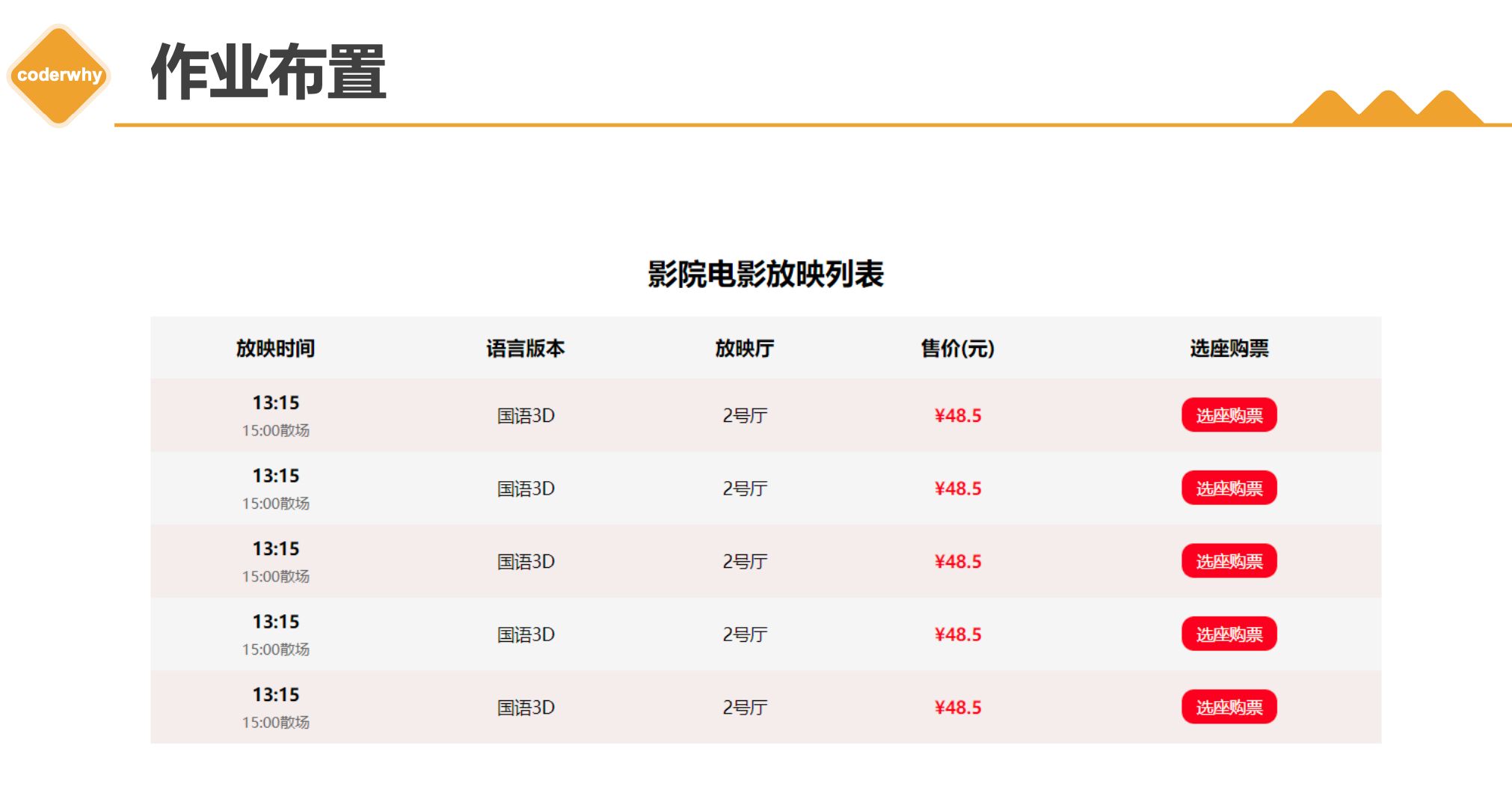
八. 找出三个盒子模型的综合案例进行练习
务必下载!!
今日的代码和讲义 以及思维导图:【点击此链接下载 Day07.zip】
大纲
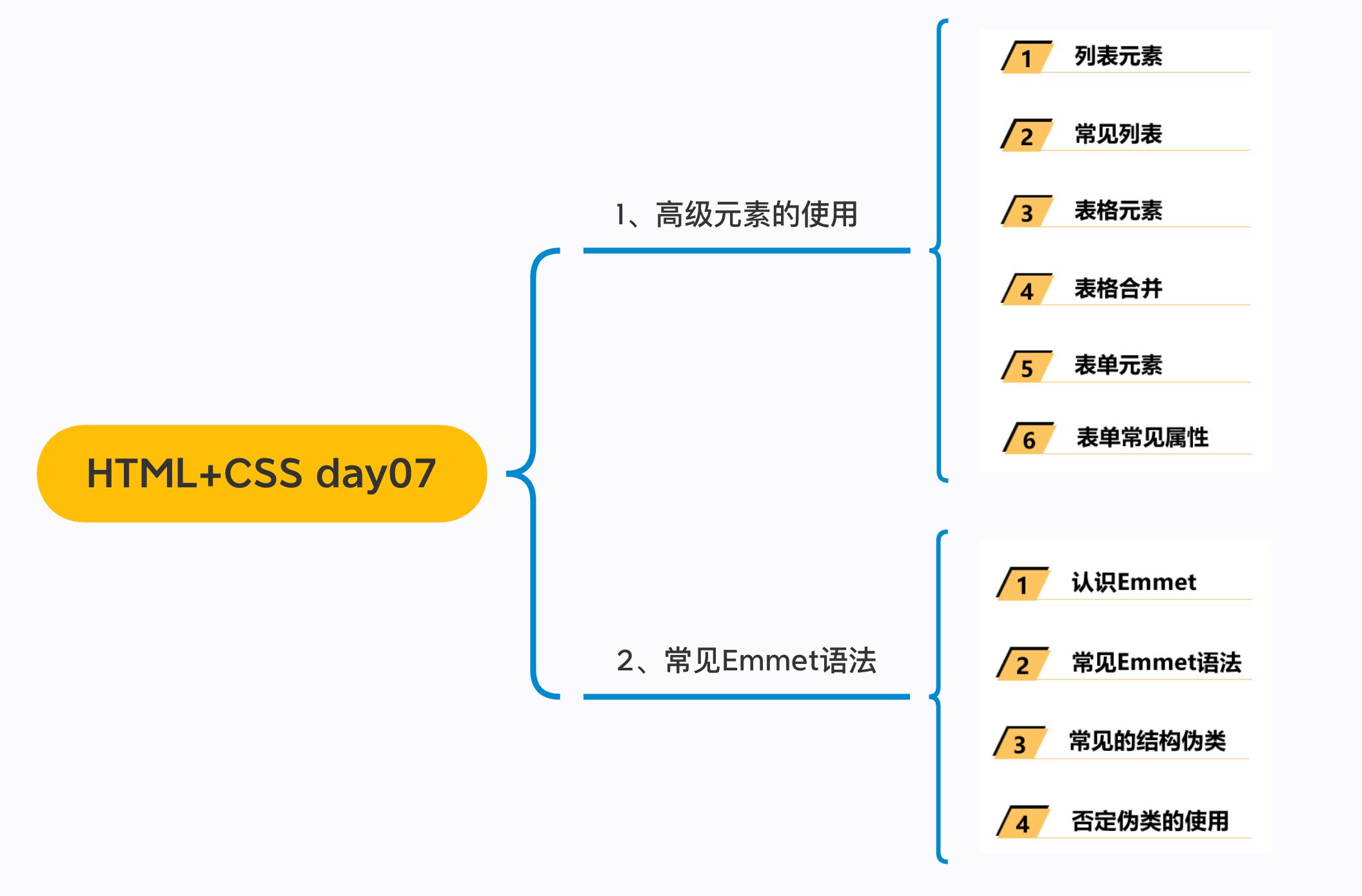
一. 列表元素
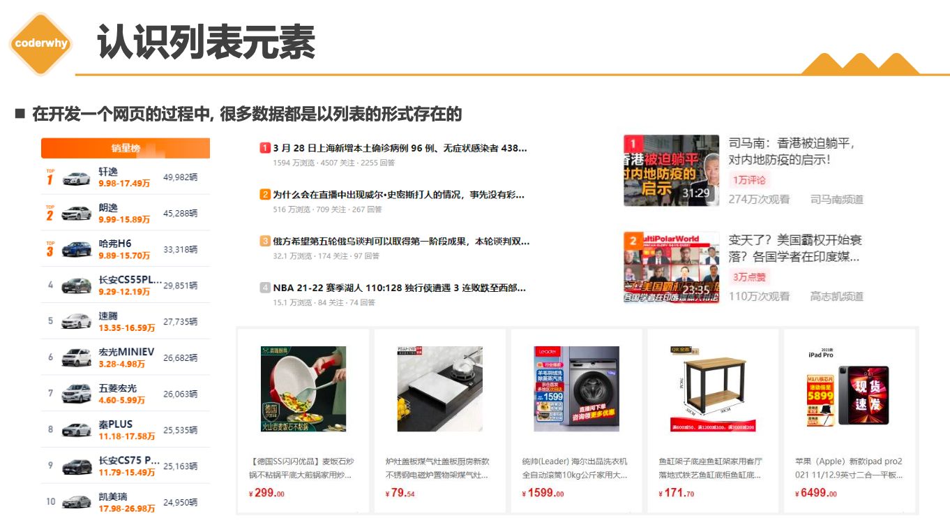
列表的实现方式
事实上现在很多的列表功能采用了不同的方案来实现:
- 方案一: 使用div元素来实现(比如汽车之家, 知乎上的很多列表)
- 方案二: 使用列表元素, 使用元素语义化的方式实现;
事实上现在很多的网站对于列表元素没有很强烈的偏好,更加不拘一格,按照自己的风格来布局:
- 原因是列表元素默认的CSS样式, 让它用起来不是非常方便;
- 比如列表元素往往有很多的限制,
ul/ol中只能存放li,li再存放其他元素, 默认样式等; - 虽然我们可以通过重置来解决, 但是我们更喜欢自由的
div;
HTML提供了
3组常用的用来展示列表的元素- 有序列表:
ol、li - 无序列表:
ul、li - 定义列表:
dl、dt、dd
- 有序列表:
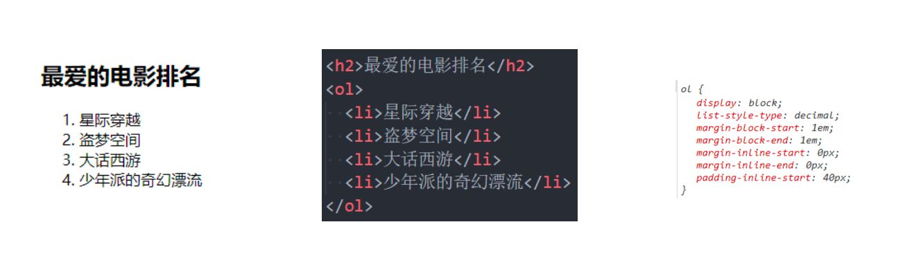
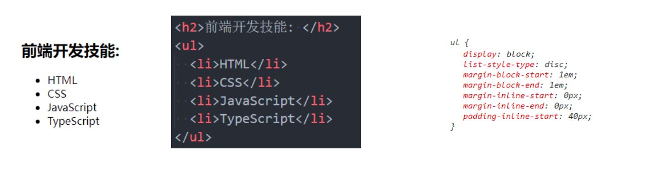
1.1. 三种列表
有序列表 – ol – li
1 | |
ol(ordered list)有序列表,直接子元素只能是li
li(list item)- 列表中的每一项
无序列表 – ul - li
ul(unordered list)- 无序列表,直接子元素只能是li
li(list item)- 列表中的每一项
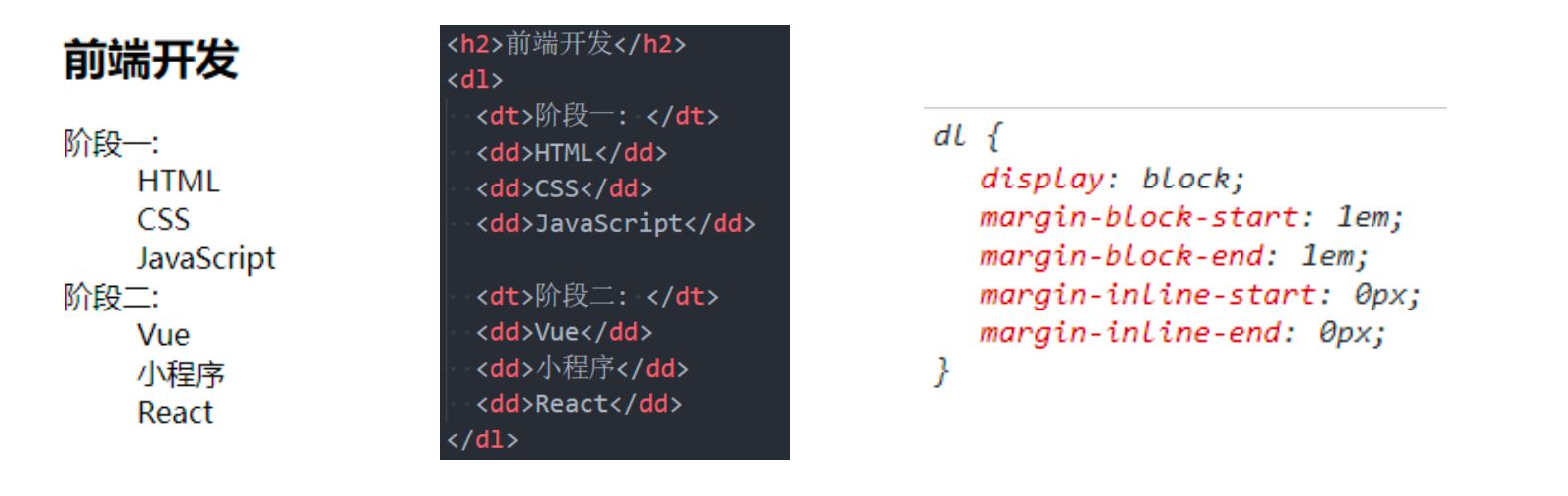
定义列表 – dl – dt - dd
dl(
definition list)- 定义列表,直接子元素只能是
dt、dd
- 定义列表,直接子元素只能是
dt(definition term)term是项的意思, 列表中每一项的项目名
dd(definition description)- 列表中每一项的具体描述,是对
dt的描述、解释、补充 - 一个
dt后面一般紧跟着1个或者多个dd
- 列表中每一项的具体描述,是对
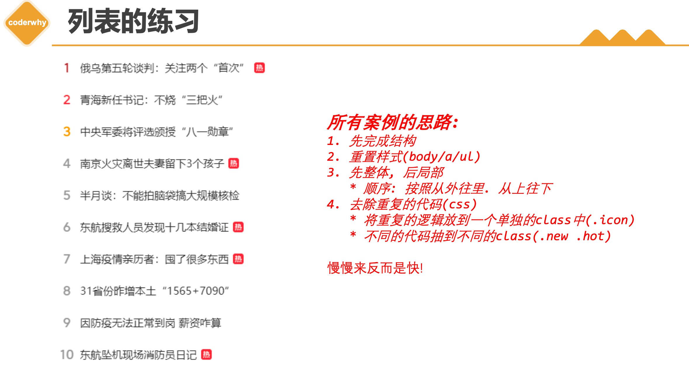
1.2. 列表案例
- 总结思路
二. table元素
- 在网页中,对于某些内容的展示使用表格元素更为合适和方便
2.1. table常见
1 | |
- 编写表格最常见的是下面的元素:
table- 表格
tr(table row)- 表格中的行
td(table data)- 行中的单元格
- 另外表格有很多相关的属性可以设置表格的样式, 但是已经不推荐使用了
2.2. 案例练习
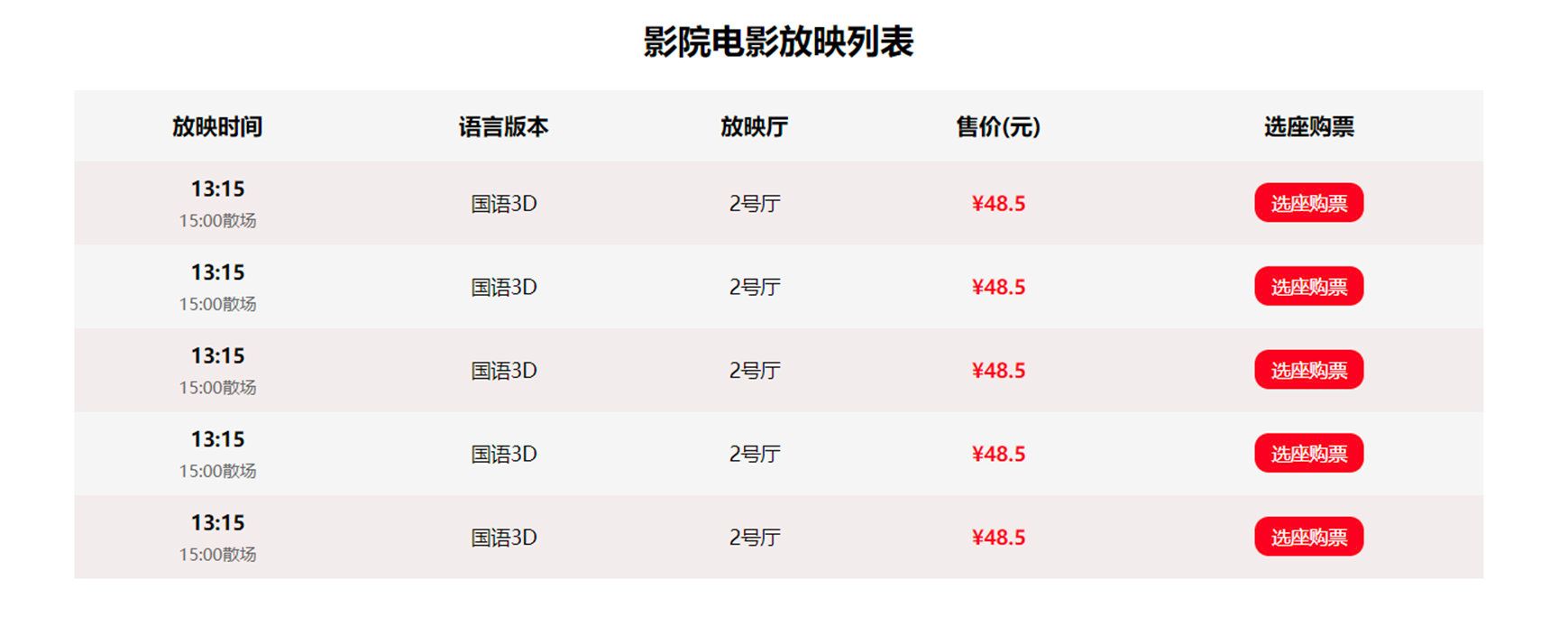
股票表格
1 | |
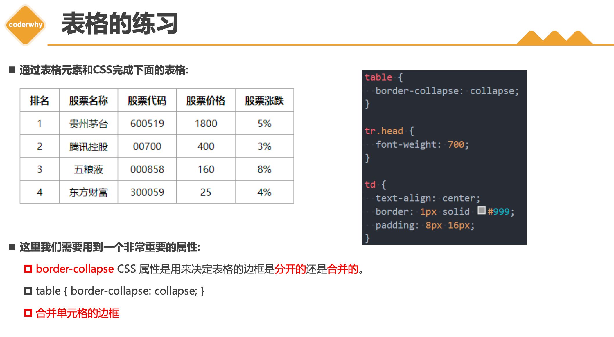
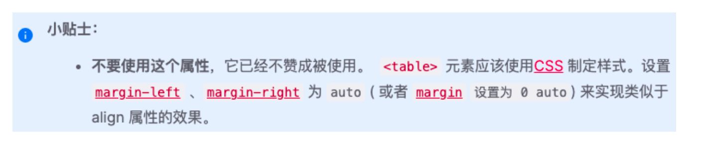
这里我们需要用到一个非常重要的属性:
border-collapseCSS 属性是用来决定表格的边框是分开的还是合并的。table { border-collapse: collapse; }合并单元格的边框
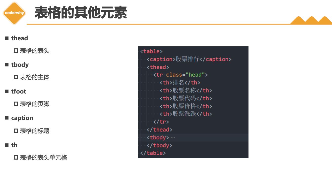
2.3. table元素
1 | |
thead- 表格的表头
tbody- 表格的主体
tfoot- 表格的页脚
caption- 表格的标题
th- 表格的表头单元格
2.4. 单元格合并
1 | |
- 在某些特殊的情况下, 每个单元格占据的大小可能并不是固定的
- 一个单元格可能会
跨多行或者多列来使用;
- 一个单元格可能会
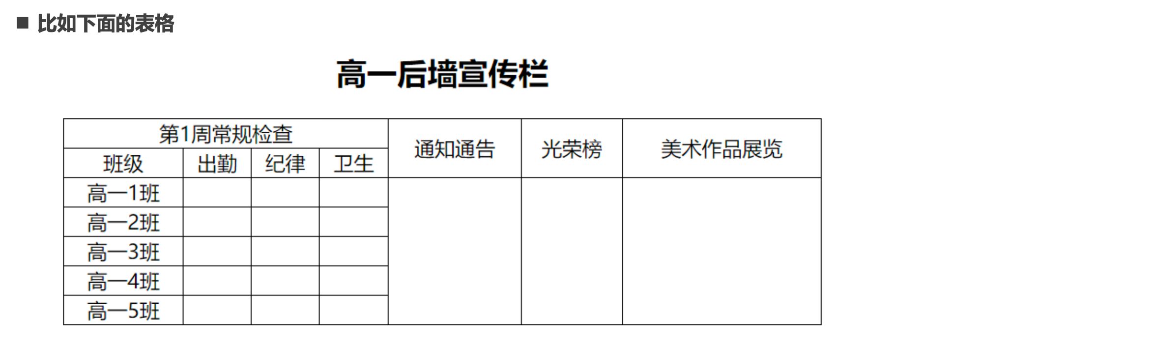
- 这个时候我们就要使用单元格合并来完成;
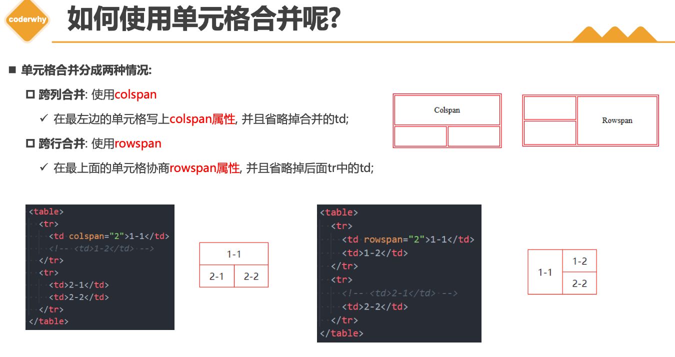
如何使用单元格合并呢?
- 单元格合并分成两种情况:
- 跨列合并: 使用
colspan- ✓ 在最左边的单元格写上
colspan属性, 并且省略掉合并的td;
- ✓ 在最左边的单元格写上
- 跨行合并: 使用
rowspan- ✓ 在最上面的单元格协商
rowspan属性, 并且省略掉后面tr中的td;
- ✓ 在最上面的单元格协商
2.5. 作业
三. 表单元素
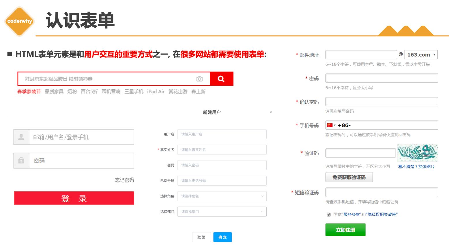
3.1. 常见表单
1 | |
form- 表单, 一般情况下,其他表单相关元素都是它的后代元素
input- 单行文本输入框、单选框、复选框、按钮等元素
textarea- 多行文本框
select、option- 下拉选择框
button- 按钮
label- 表单元素的标题
3.2. input元素
- type
- text
- password
- time
- date
- disabled/autofoucs/readonly
- MDN文档
- boolean属性写法
input元素的使用
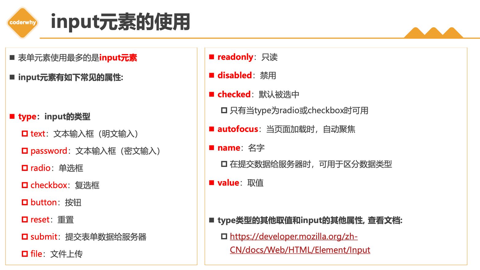
- 表单元素使用最多的是
input元素 input元素有如下常见的属性:type:input的类型text:文本输入框(明文输入)password:文本输入框(密文输入)radio:单选框checkbox:复选框button:按钮reset:重置submit:提交表单数据给服务器file:文件上传
readonly:只读disabled:禁用checked:默认被选中- 只有当
type为radio或checkbox时可用
- 只有当
autofocus:当页面加载时,自动聚焦name:名字- 在提交数据给服务器时,可用于区分数据类型
value:取值type类型的其他取值和input的其他属性, 查看文档:- https://developer.mozilla.org/zh-CN/docs/Web/HTML/Element/Input
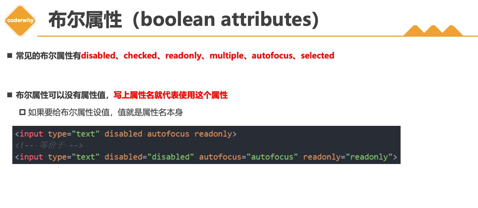
布尔属性(boolean attributes)
- 常见的布尔属性有
disabled、checked、readonly、multiple、autofocus、selected - 布尔属性可以没有属性值,写上属性名就代表使用这个属性
- 如果要给布尔属性设值,值就是属性名本身
3.3. input模拟按钮
1 | |
表单可以实现按钮效果:
普通按钮(
type=button):使用value属性设置按钮文字重置按钮(
type=reset):重置它所属form的所有表单元素(包括input、textarea、select)提交按钮(
type=submit):提交它所属form的表单数据给服务器(包括input、textarea、select)
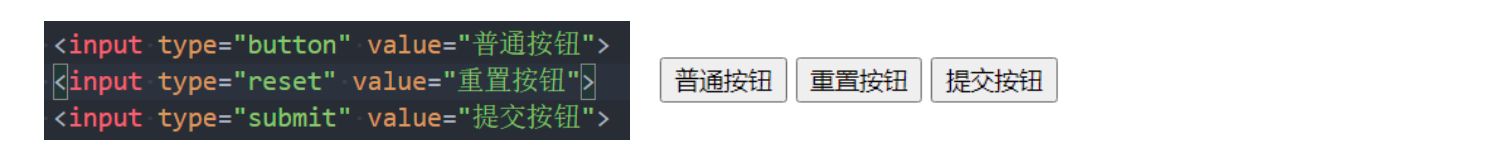
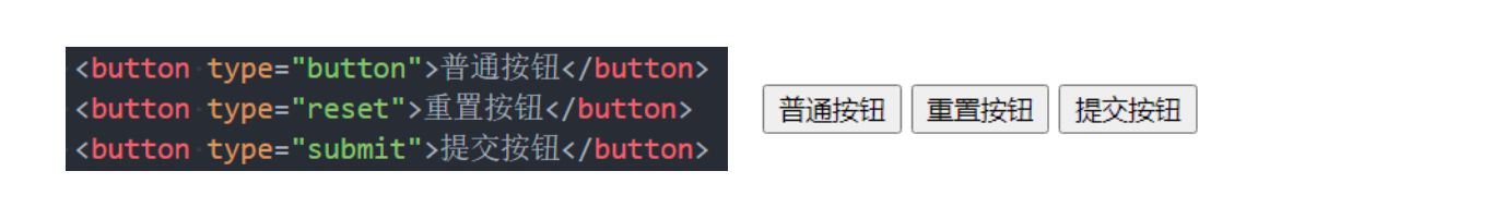
- 我们也可以通过按钮来实现:
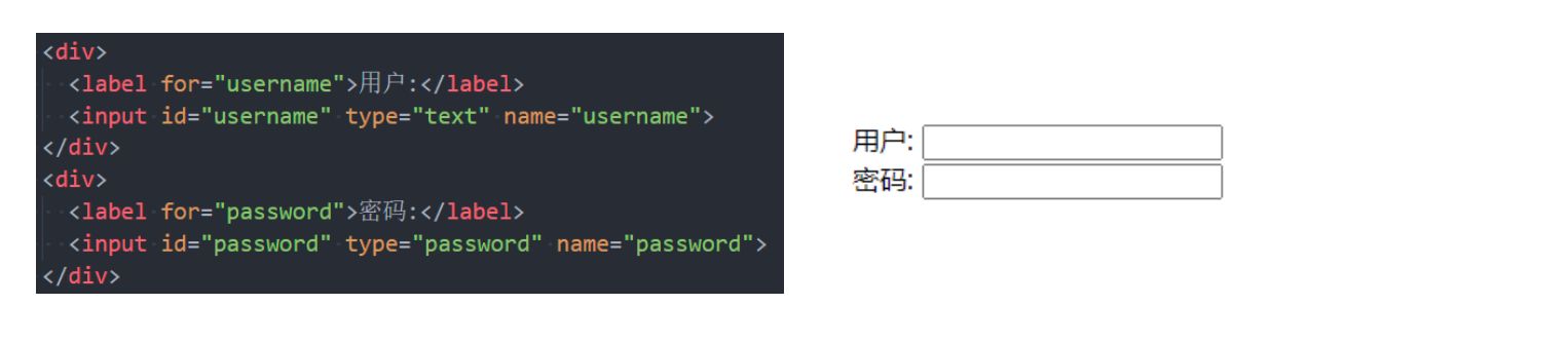
3.4. input和label结合
label元素一般跟input配合使用,用来表示input的标题labe可以跟某个input绑定,点击label就可以激活对应的input变成选中
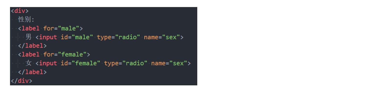
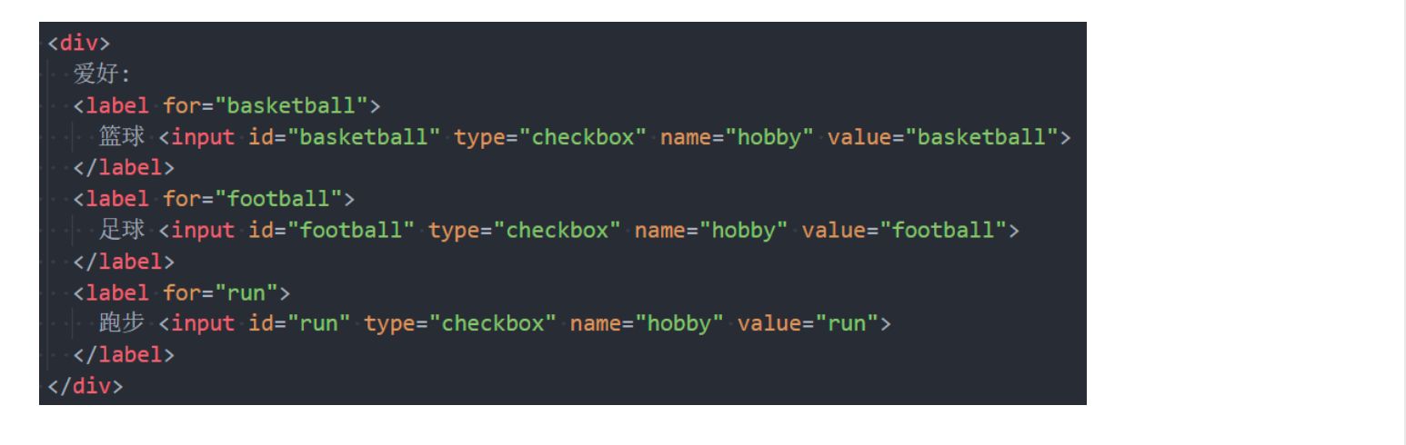
3.5. radio/checkbox
1 | |
radio的使用
- 我们可以将
type类型设置为radio变成 单选框:name值相同的radio才具备单选功能
checkbox的使用
- 我们可以将
type类型设置为checkbox变成多选框:- 属于
同一种类型的checkbox,name值要保持一致
- 属于
3.6. textarea/select/option
textarea的使用
textarea的常用属性:cols:列数rows:行数
- 缩放的CSS设置
- 禁止缩放:
resize: none; - 水平缩放:
resize: horizontal; - 垂直缩放:
resize: vertical; - 水平垂直缩放:
resize: both;
- 禁止缩放:
select和option的使用
option是select的子元素,一个option代表一个选项select常用属性multiple:可以多选size:显示多少项
option常用属性selected:默认被选中
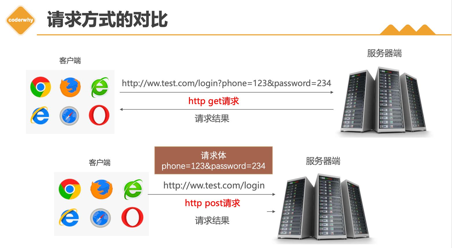
3.7. form表单
1 | |
form通常作为表单元素的父元素:form可以将整个表单作为一个整体来进行操作;- 比如对整个表单进行重置;
- 比如对整个表单的数据进行提交;
form常见的属性如下:action- 用于
提交表单数据的请求URL
- 用于
method- 请求方法(
get和post),默认是get
- 请求方法(
target- 在什么地方打开URL(参考
a元素的target)
- 在什么地方打开URL(参考
请求方式的对比
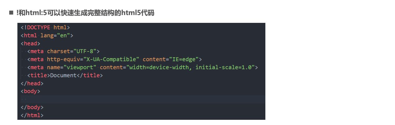
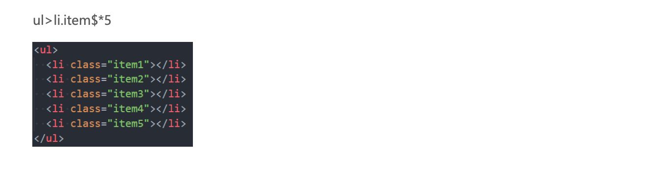
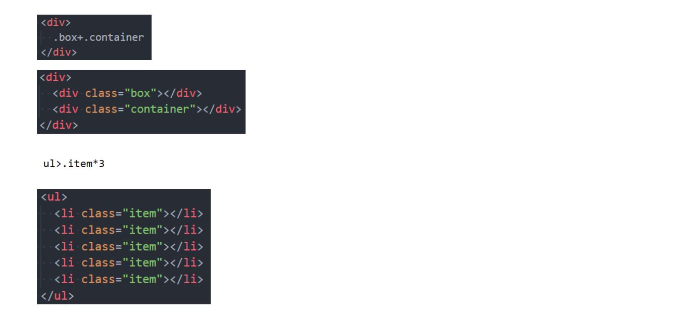
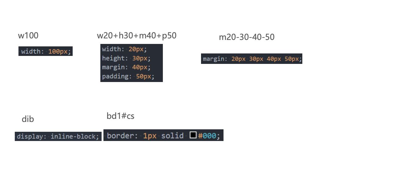
四. Emmet
1 | |
Emmet(前身为Zen Coding) 是一个能大幅度提高前端开发效率的一个工具.- 在前端开发的过程中,一大部分的工作是写
HTML、CSS代码, 如果手动来编写效果会非常低. VsCode内置了Emmet语法,在后缀为.html/.css中输入缩写后按Tab/Enter键即会自动生成相应代码
- 在前端开发的过程中,一大部分的工作是写
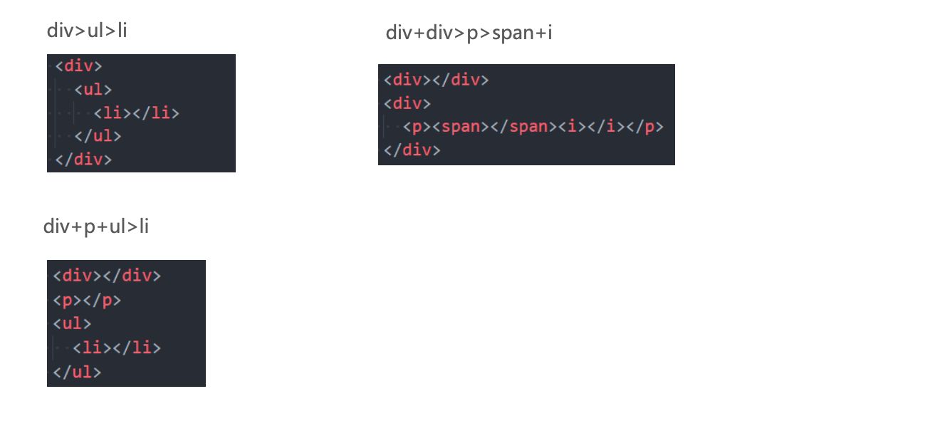
> (子代)和 + (兄弟)
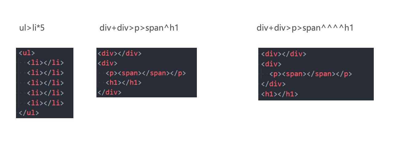
* (多个)和 ^ (上一级)
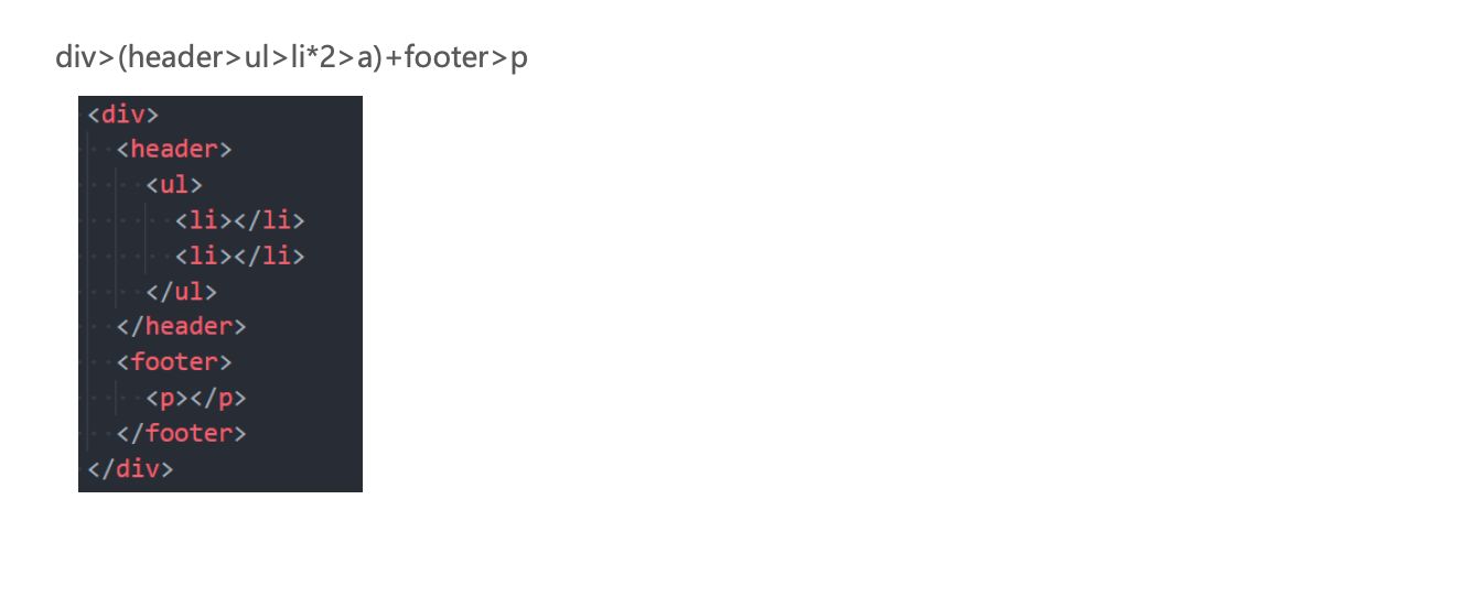
()(分组)
属性(id属性、class属性、普通属性) {}(内容)
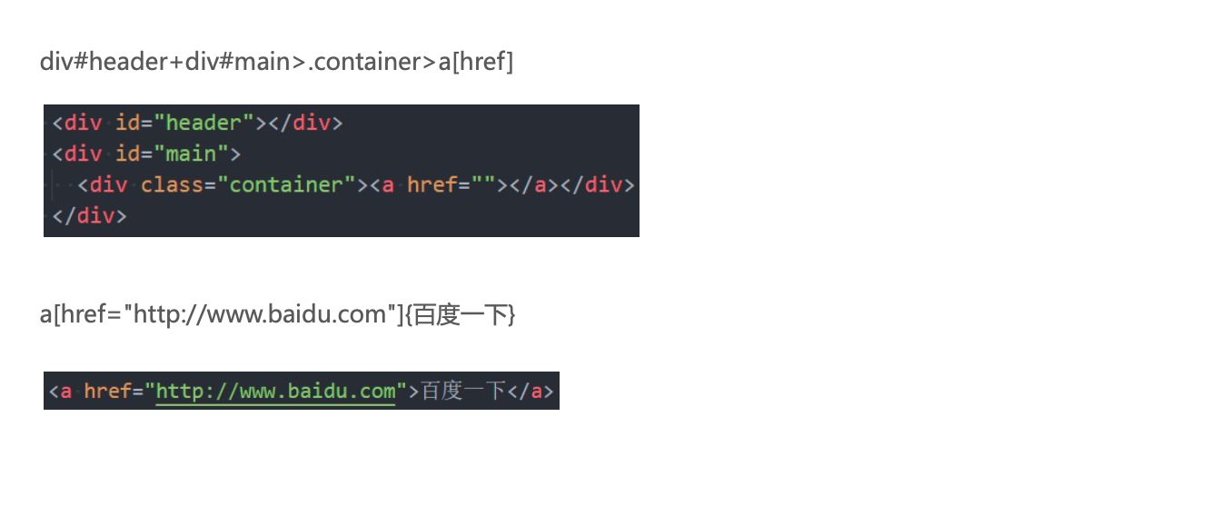
$(数字)
隐式标签
CSS Emmet
结构伪类 - :nth-child
:nth-child(1)- 是
父元素中的第1个子元素
- 是
:nth-child(2n)n代表任意正整数和0- 是父元素中的第偶数个子元素(第
2、4、6、8……个) - 跟
:nth-child(even)同义
:nth-child(2n + 1)n代表任意正整数和0- 是父元素中的第奇数个子元素(第
1、3、5、7……个) - 跟
:nth-child(odd)同义
nth-child(-n + 2)- 代表前2个子元素
结构伪类 - :nth-last-child( )
:nth-last-child()的语法跟:nth-child()类似,不同点是:nth-last-child()从最后一个子元素开始往前计数:nth-last-child(1),代表倒数第一个子元素:nth-last-child(-n + 2),代表最后2个子元素
:nth-of-type()用法跟:nth-child()类似- 不同点是
:nth-of-type()计数时只计算同种类型的元素
- 不同点是
:nth-last-of-type()用法跟:nth-of-type()类似- 不同点是
:nth-last-of-type()从最后一个这种类型的子元素开始往前计数
- 不同点是
结构伪类 - :nth-of-type( )、:nth-last-of-type( )
- 其他常见的伪类(了解):
:first-child,等同于:nth-child(1):last-child,等同于:nth-last-child(1):first-of-type,等同于:nth-of-type(1):last-of-type,等同于:nth-last-of-type(1):only-child,是父元素中唯一的子元素:only-of-type,是父元素中唯一的这种类型的子元素
- 下面的伪类偶尔会使用:
:root,根元素,就是HTML元素:empty代表里面完全空白的元素
否定伪类(negation pseudo-class)
:not()的格式是:not(x)x是一个简单选择器元素选择器、通用选择器、属性选择器、类选择器、id选择器、伪类(除否定伪类)
:not(x)表示 除x以外的元素


![KubeEdge | [进阶] KubeEdge高可用环境搭建](https://img.onmicrosoft.cn/ke/202305180000661.png)