今日作业
1
2
3
4
5
6
7
8
9
10
11
12
13
14
15
16
17
| # Day06 作业布置
## 一. 完成课堂所有的代码
## 二. 写出盒子模型包含的内容以及如何设置
## 三. 说说你对margin的传递和折叠的理解
## 四. 行内非替换元素在设置padding/border的上下时,有什么特殊的地方?
## 五. 整理box-sizing的作用,以及content-box和border-box的区别
## 六. 说出元素水平居中的方案以及对应的场景
## 七. 练习background-position和background-size(为精灵图做准备)
## 八. 找出三个盒子模型的综合案例进行练习
|
Day05作业布置
一. 写出案例,证明CSS属性的继承性
当给父元素div(类名为box)设置font-size,color,text-align这些属性时,由于这些属性具有继承性,所以该父元素下的所有子元素(p,span,div)都会默认继承这些属性
1
2
3
4
5
6
7
8
9
10
11
12
13
14
15
16
17
18
19
20
21
22
23
24
25
26
27
| <!DOCTYPE html>
<html lang="en">
<head>
<meta charset="UTF-8" />
<meta http-equiv="X-UA-Compatible" content="IE=edge" />
<meta name="viewport" content="width=device-width, initial-scale=1.0" />
<title>Document</title>
<style>
.box {
width: 400px;
height: 400px;
font-size: 30px;
color: green;
text-align: center;
background-color: pink;
}
</style>
</head>
<body>
<div class="box">
<div class="one">鹅鹅鹅<span>床前明月光</span></div>
<p>我是p元素</p>
</div>
</body>
</html>
|
二. 写出案例,证明CSS属性的层叠性
一个CSS属性可以多次设置:
判断一: 权重, 优先级;
判断二: 先后顺序;
1
2
3
4
5
6
7
8
9
10
11
12
13
14
15
16
17
18
19
20
21
22
23
24
25
26
27
28
29
30
31
| <!DOCTYPE html>
<html lang="en">
<head>
<meta charset="UTF-8" />
<meta http-equiv="X-UA-Compatible" content="IE=edge" />
<meta name="viewport" content="width=device-width, initial-scale=1.0" />
<title>Document</title>
<style>
#first {
color: green;
}
div {
color: red;
}
.one {
color: blue;
}
.two {
color: orange;
}
</style>
</head>
<body>
<div class="one two" id="first">我是div元素</div>
</body>
</html>
|
三. 默写出display常见的值,并且说出对应的特性,并且写出测试案例
block:让元素显示为块级元素;可以让元素独占一行,可以设置宽度和高度,高度默认由内容决定
inline:让元素显示为行内级元素 ;可以和其他行内级元素在同一行,不可以设置宽度和高度,宽度和高度由内容决定
inline-block:让元素同时具备行内级、块级元素的特征 ;可以和其他行内级元素在同一行,可以设置宽度和高度,默认宽度和高度由内容决定
none:隐藏元素
1
2
3
4
5
6
7
8
9
10
11
12
13
14
15
16
17
18
19
20
21
22
23
24
25
26
27
28
29
30
31
32
33
34
35
36
37
38
39
40
41
42
43
44
45
46
47
48
49
| <!DOCTYPE html>
<html lang="en">
<head>
<meta charset="UTF-8" />
<meta http-equiv="X-UA-Compatible" content="IE=edge" />
<meta name="viewport" content="width=device-width, initial-scale=1.0" />
<title>Document</title>
<style>
.one {
width: 300px;
height: 300px;
background-color: pink;
overflow: hidden;
}
.one span {
display: block;
width: 200px;
height: 200px;
background-color: red;
margin: 10px auto;
}
p {
display: inline;
font-size: 20px;
}
.two::after {
content: "";
display: inline-block;
width: 10px;
height: 10px;
background-color: green;
}
.three {
display: none;
}
</style>
</head>
<body>
<div class="one">
<span>我要变成块级元素</span>
</div>
<p>我要变成行内级元素</p>
<a href="#">百度一下</a>
<div class="two">在元素前面用伪元素插入123</div>
<div class="three">我要隐藏</div>
</body>
</html>
|
四. 总结元素隐藏的方法,并且说出他们的区别
display:none
- 元素不显示出来, 并且也不占据位置, 不占据任何空间
visibility:hidden
rgba设置颜色,将a的值设置为0
- rgba的a设置的是alpha值, 可以设置透明度, 不影响子元素
opacity设置透明度, 设置为0
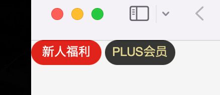
五.京东案例
1
2
3
4
5
6
7
8
9
10
11
12
13
14
15
16
17
18
19
20
21
22
23
24
25
26
27
28
29
30
31
32
33
34
35
36
37
38
39
40
41
| <!DOCTYPE html>
<html lang="en">
<head>
<meta charset="UTF-8" />
<meta http-equiv="X-UA-Compatible" content="IE=edge" />
<meta name="viewport" content="width=device-width, initial-scale=1.0" />
<title>Document</title>
<style>
.box {
display: flex;
justify-content: space-around;
align-items: center;
width: 300px;
height: 200px;
margin: 0 auto;
}
.item {
width: 120px;
height: 50px;
line-height: 50px;
font-size: 20px;
color: #fff;
text-align: center;
padding: 0 5px;
border-radius: 25px;
background: #e1251b;
}
.plus {
background: #363634;
color: #e5d790;
}
</style>
</head>
<body>
<div class="box">
<div class="new item">新人福利</div>
<div class="plus item">PLUS会员</div>
</div>
</body>
</html>
|
七. 进行下面的案例练习
- 可以先不做两行显示不全的…
- 可以先不做评论的靠右内容
1
2
3
4
5
6
7
8
9
10
11
12
13
14
15
16
17
18
19
20
21
22
23
24
25
26
27
28
29
30
31
32
33
34
35
36
37
38
39
40
41
42
43
44
45
46
47
48
49
50
51
52
53
54
55
56
57
58
59
60
61
62
63
64
65
66
67
68
69
70
71
72
73
74
75
76
77
78
| <!DOCTYPE html>
<html lang="en">
<head>
<meta charset="UTF-8" />
<meta http-equiv="X-UA-Compatible" content="IE=edge" />
<meta name="viewport" content="width=device-width, initial-scale=1.0" />
<title>Document</title>
<style>
.goods {
width: 400px;
margin: 100px auto;
padding: 10px;
background-color: #f6f6f6;
}
.goods-img {
height: 400px;
border: 1px solid #ccc;
overflow: hidden;
}
.goods-img img {
width: 100%;
}
.goods-info {
text-overflow: -o-ellipsis-lastline;
overflow: hidden;
text-overflow: ellipsis;
display: -webkit-box;
-webkit-line-clamp: 2;
line-clamp: 2;
-webkit-box-orient: vertical;
margin: 8px 0;
}
.goods-price {
display: flex;
justify-content: space-between;
align-items: center;
height: 45px;
color: #999;
}
.price {
display: flex;
align-items: flex-end;
font-weight: 700;
}
.present-price {
color: red;
}
.present-price span {
font-size: 24px;
}
.origin-price span {
text-decoration: line-through;
}
</style>
</head>
<body>
<div class="goods">
<div class="goods-img">
<img
src="https://img12.360buyimg.com/n1/jfs/t1/159701/38/9948/81556/6040d1d9E6b486d68/5829df13f7b07b58.jpg"
/>
</div>
<h2 class="goods-info">
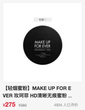
【轻烟蜜粉】MAKE UP FOR EVER 玫珂菲 HD清晰无痕蜜粉 饼 6.2g(控油定妆粉饼
补妆便携 雾面哑光)
</h2>
<div class="goods-price">
<div class="price">
<div class="present-price">¥<span>275</span></div>
<div class="origin-price">¥<span>380</span></div>
</div>
<div class="comment">4934人已经评价</div>
</div>
</div>
</body>
</html>
|
务必下载!!
今日的代码和讲义 以及思维导图:【点击此链接下载 Day06.zip】
大纲
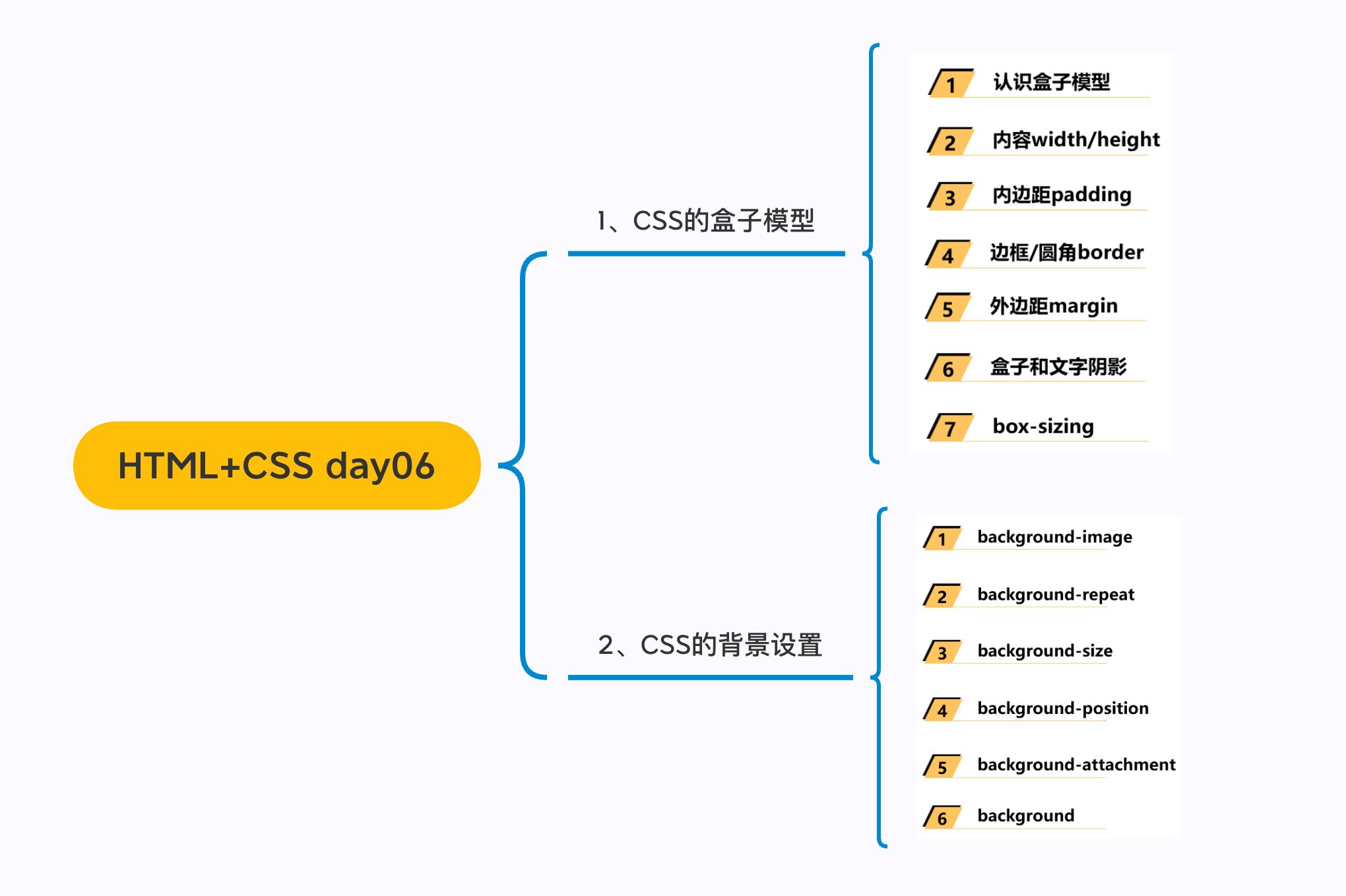
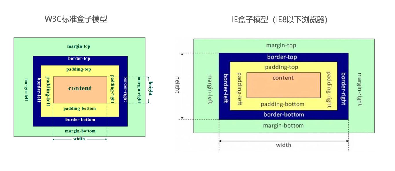
一. 盒子模型
1.1. margin
1
2
3
4
5
6
7
8
| * margin的设置问题
* top/right/bottom/left
* margin和padding的选择
* margin的传递和折叠
* 父子的传递
* 兄弟的折叠
* margin进行水平居中
* 0 auto;
|
外边距 - margin
margin属性用于设置盒子的外边距,通常用于元素和元素之间的间距;
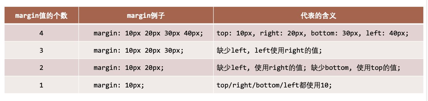
margin包括四个方向,所以有如下的取值:
margin-top:上内边距margin-right:右内边距margin-bottom:下内边距margin-left:左内边距
margin单独编写是一个缩写属性:
margin-top、margin-right、margin-bottom、margin-left的简写属性margin缩写属性是从零点钟方向开始, 沿着顺时针转动的, 也就是上右下左;
margin也并非必须是四个值, 也可以有其他值;
margin 的其他值
上下 margin 的传递
margin-top传递
- 如果块级元素的顶部线和父元素的顶部线重叠,那么这个块级元素的
margin-top 值会传递给父元素
margin-bottom传递
- 如果块级元素的底部线和父元素的底部线重写,并且父元素的高度是
auto ,那么这个块级元素的 margin-bottom 值会传递给父元素
- 如何防止出现传递问题?
- 给父元素设置
padding-top\padding-bottom
- 给父元素设置
border
- 触发
BFC: 设置 overflow 为 auto(Block formating context)
- 建议
margin一般是用来设置兄弟元素之间的间距padding一般是用来设置父子元素之间的间距
上下margin的折叠
- 垂直方向上相邻的2个
margin( margin-top 、 margin-bottom )有可能会合并为1个margin,这种现象叫做collapse(折叠)
- 水平方向上的
margin ( margin-left、margin-right)永远不会collapse
- 折叠后最终值的计算规则
- 如何防止
margin collapse?
上下margin折叠的情况
块级元素的居中
- 在一些需求中,需要元素在父元素中水平居中显示(父元素一般都是
块级元素、inline-block)
- 行内级元素(包括
inline-block元素)
- 水平居中:在父元素中设置
text-align: center
- 块级元素
1.2. outline
1
2
3
4
5
6
7
| * 外轮廓(很少会用到)
```css
a, input {
outline: none;
}
```
|
outline 表示元素的外轮廓
outline相关属性有
outline-width: 外轮廓的宽度outline-style:取值跟border的样式一样,比如solid、dotted等outline-color: 外轮廓的颜色outline:outline-width、outline-style、outline-color的简写属性,跟border用法类似
应用实例
去除a元素、input元素 的 focus轮廓效果
1.3. box-shadow
1
| box-shadow: offset-x offset-y blur-radius spread-radius color
|
盒子阴影 – box-shadow
- **box-shadow **属性可以设置一个或者多个阴影
- 每个阴影用
<shadow>表示
- 多个阴影之间用逗号,隔开,从前到后叠加
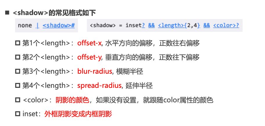
<shadow>的常见格式如下
- 第1个
<length>:offset-x, 水平方向的偏移,正数往右偏移
- 第2个
<length>:offset-y, 垂直方向的偏移,正数往下偏移
- 第3个
<length>:blur-radius, 模糊半径
- 第4个
<length>:spread-radius, 延伸半径
<color>:阴影的颜色,如果没有设置,就跟随color属性的颜色inset:外框阴影变成内框阴影
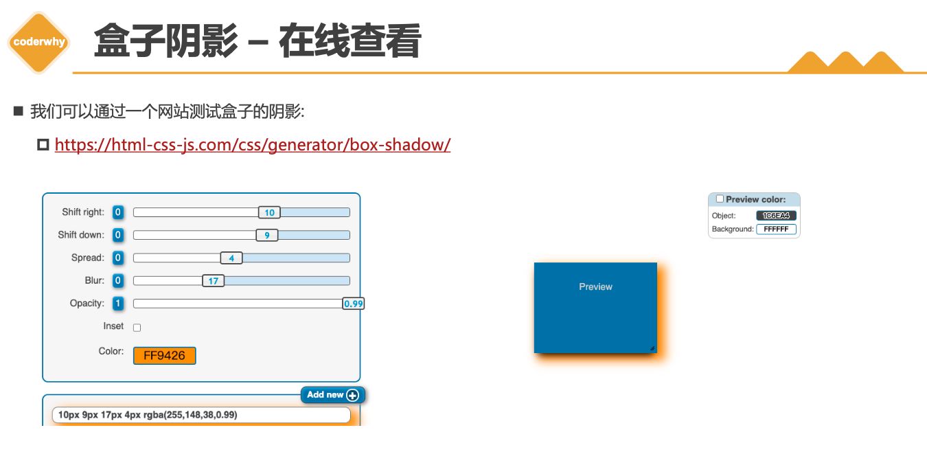
盒子阴影 – 在线查看
1.4. text-shadow
1
| text-shadow: offset offset-y blur color;
|
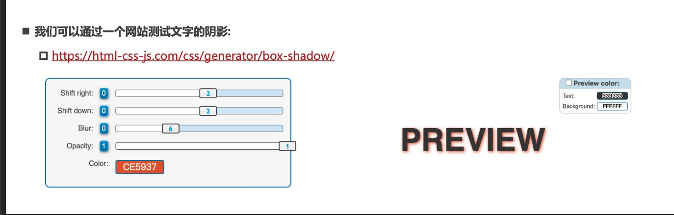
文字阴影 - text-shadow
- text-shadow用法类似于
box-shadow ,用于给文字添加阴影效果
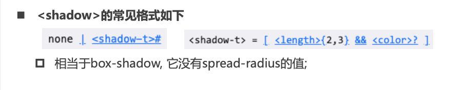
<shadow>的常见格式如下(没有向内)
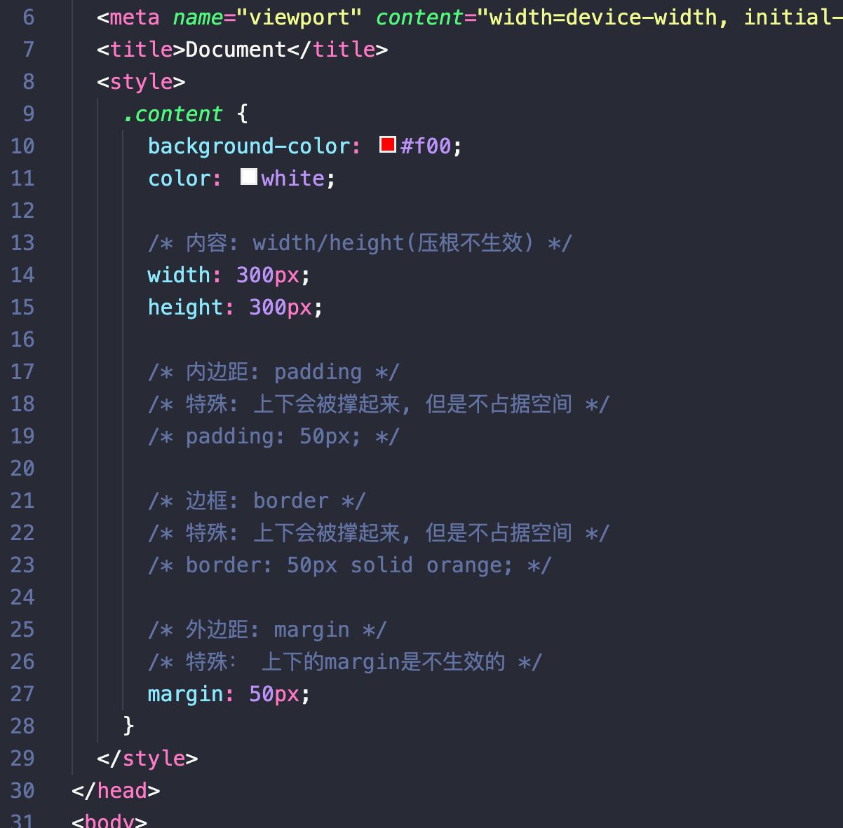
行内非替换元素的注意事项
- 以下属性对行内级非替换元素不起作用
width、height、margin-top、margin-bottom
- 以下属性对行内级非替换元素的效果比较特殊
padding-top、padding-bottom、上下方向的border
综合案例练习
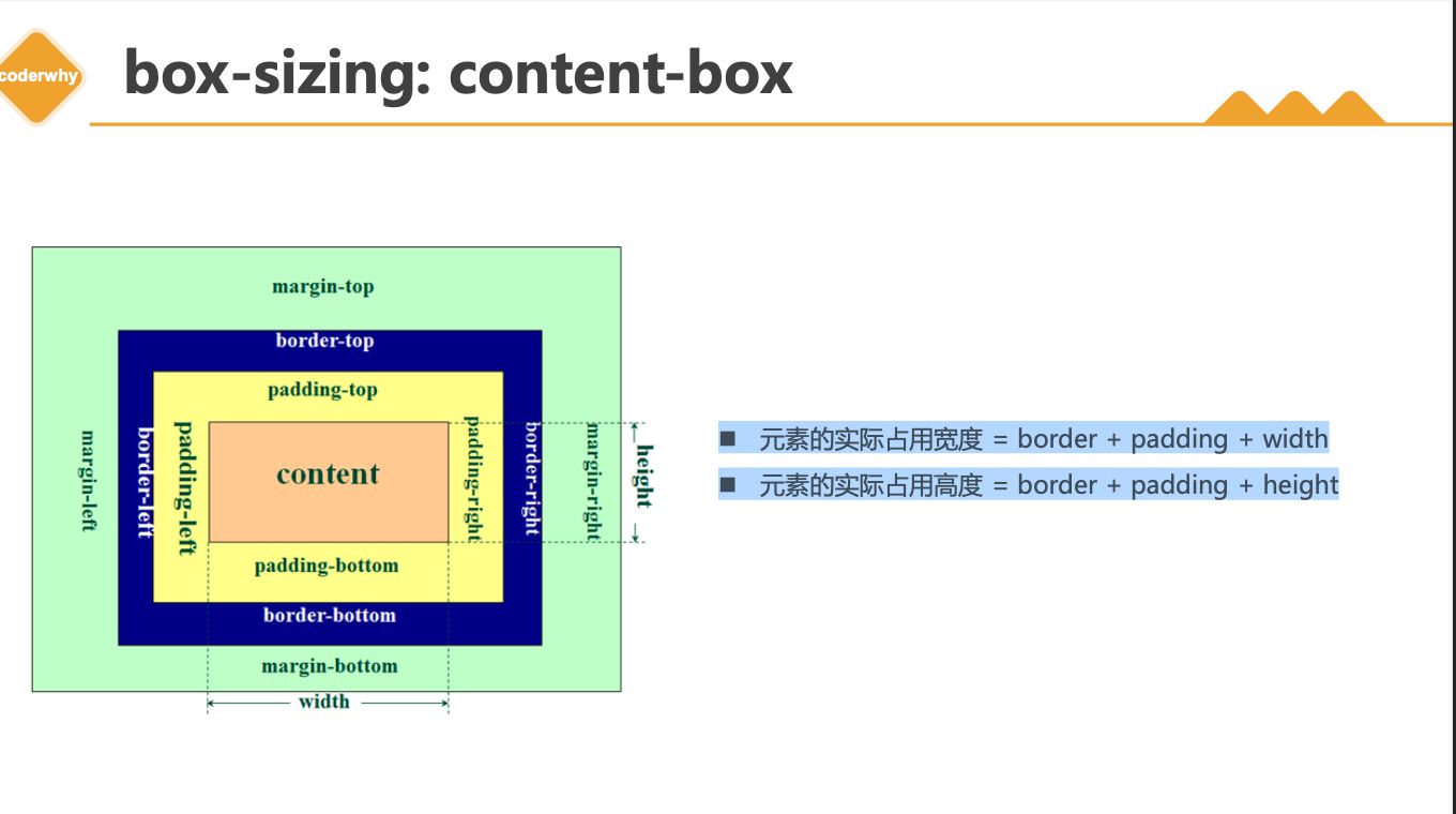
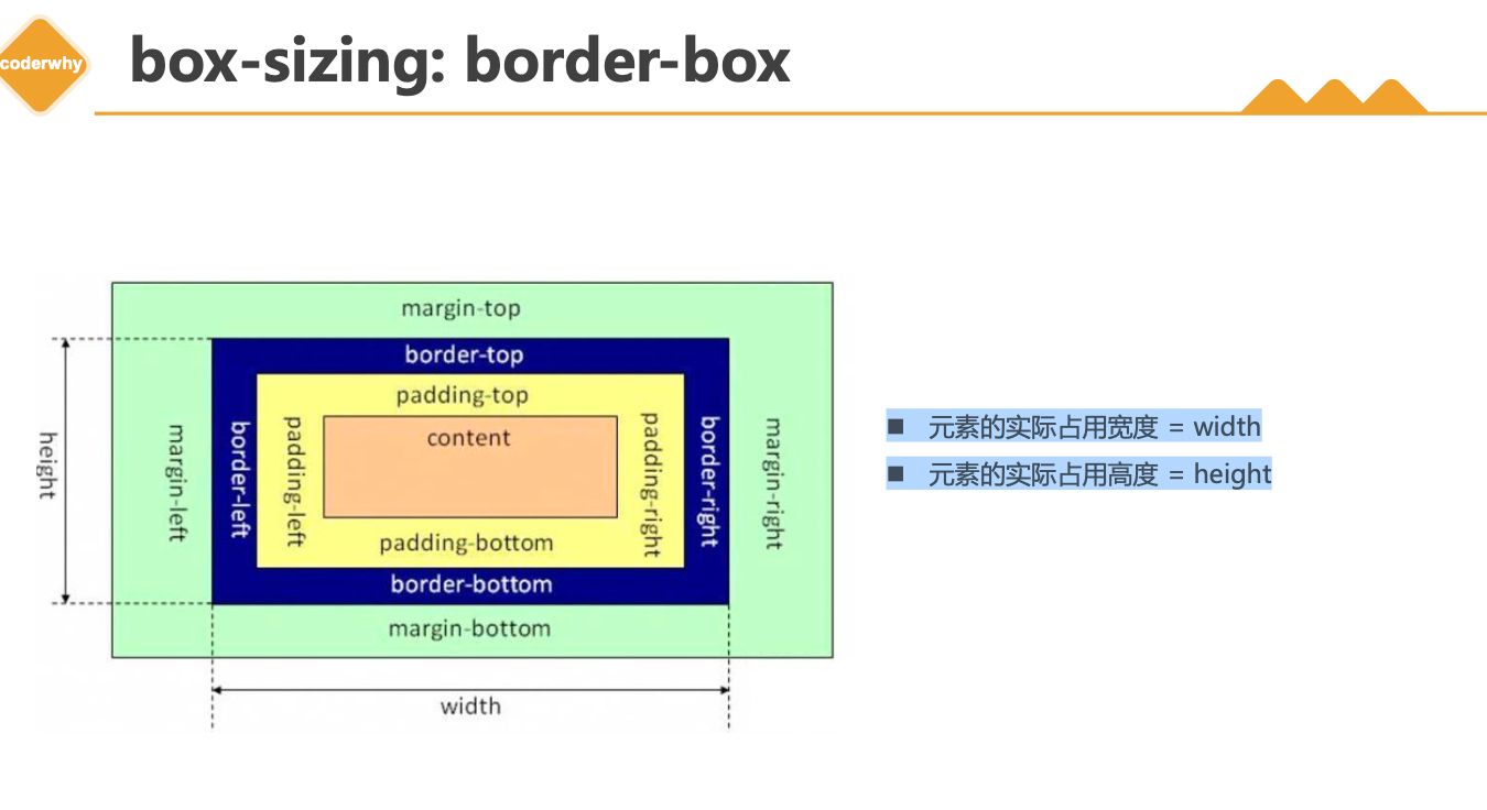
1.5. box-sizing
- content-box
- border-box(常用)
CSS属性 - box-sizing
box-sizing 用来设置盒子模型中宽高的行为content-box
padding、border都布置在width、height外边
border-box
padding、border都布置在width、height里边
box-sizing: content-box
box-sizing: border-box
元素的实际占用宽度 = width元素的实际占用高度 = height
IE盒子模型
1.6. 注意事项
1
2
| * width/height/margin-top/margin-bottom 对于行内非替换元素是无效的
* padding-top/bottom, border-top/bottom 对于行内非替换元素有特殊效果
|
1.7. 水平居中
1
2
3
4
| * 行内级元素
* text-align: center
* 块级元素 有宽度
* margin: 0 auto;
|
元素的水平居中方案
- 在一些需求中,需要元素在父元素中水平居中显示(父元素一般都是
块级元素、inline-block)
- 行内级元素(包括
inline-block元素)
- 水平居中:在父元素中设置
text-align: center
- 块级元素
二. 案例练习
2.1. 京东小按钮
1
2
3
4
5
6
7
8
9
10
11
12
13
14
15
16
17
18
19
20
21
22
23
24
25
26
27
28
29
30
31
32
33
34
35
36
37
38
39
40
41
42
43
44
45
46
47
| <!DOCTYPE html>
<html lang="en">
<head>
<meta charset="UTF-8">
<meta http-equiv="X-UA-Compatible" content="IE=edge">
<meta name="viewport" content="width=device-width, initial-scale=1.0">
<title>Document</title>
<link rel="stylesheet" href="./css/reset.css">
<style>
.btn {
display: inline-block;
width: 70px;
height: 25px;
line-height: 25px;
text-align: center;
border-radius: 13px;
}
.btn:hover {
background-color: #c81623;
color: #fff;
}
.new {
background-color: #e1251b;
color: #fff;
}
.vip {
background-color: #363634;
color: #e5d790;
}
</style>
</head>
<body>
<a class="btn new" href="https://xinren.jd.com/?channel=99#/home" target="_blank">新人福利</a>
<a class="btn vip" href="https://passport.jd.com/new/login.aspx" target="_blank">PLUS会员</a>
</body>
</html>
|
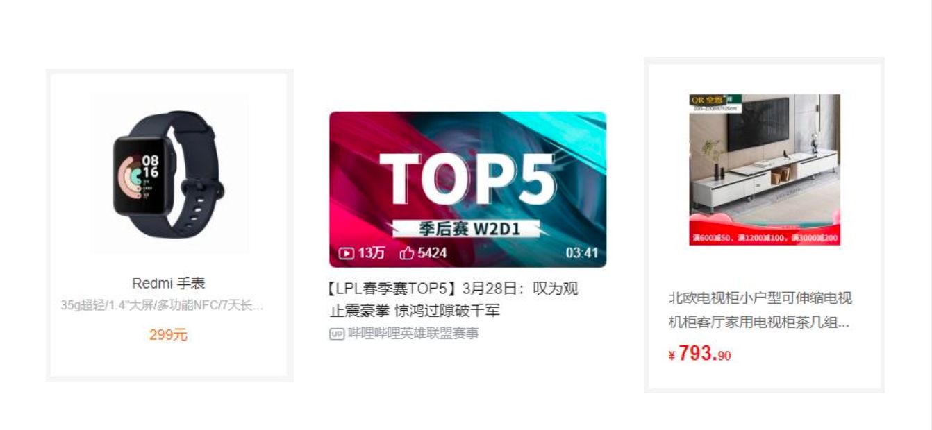
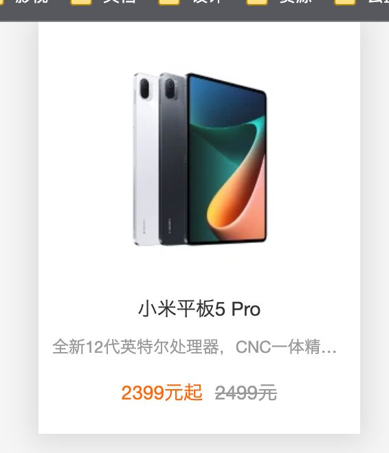
2.2. 小米的商品
1
2
3
4
5
6
7
8
9
10
11
12
13
14
15
16
17
18
19
20
21
22
23
24
25
26
27
28
29
30
31
| <!DOCTYPE html>
<html lang="en">
<head>
<meta charset="UTF-8">
<meta http-equiv="X-UA-Compatible" content="IE=edge">
<meta name="viewport" content="width=device-width, initial-scale=1.0">
<title>Document</title>
<link rel="stylesheet" href="./css/reset.css">
<link rel="stylesheet" href="./css/demo02.css">
<style>
body {
text-align: center;
}
</style>
</head>
<body>
<a class="item" href="https://www.mi.com/xiaomipad5pro" target="_blank">
<img src="../images/xiaomi01.webp" alt="">
<h3 class="title">小米平板5 Pro</h3>
<p class="desc">
全新12代英特尔处理器,CNC一体精雕工艺,2.5K 120Hz高清屏,可选MX550独立显卡
</p>
<div class="price">
<span class="new-price">2399元起</span>
<span class="old-price">2499元</span>
</div>
</a>
</body>
</html>
|
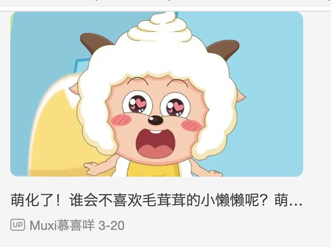
2.3. B站视频展示
1
2
3
4
5
6
7
8
9
10
11
12
13
14
15
16
17
18
19
20
21
22
23
24
25
26
27
28
29
30
31
32
33
34
35
36
37
38
39
40
41
42
43
44
45
46
47
48
49
50
51
52
53
54
55
56
57
58
59
60
61
62
63
64
65
66
67
68
69
70
71
72
73
| <!DOCTYPE html>
<html lang="en">
<head>
<meta charset="UTF-8">
<meta http-equiv="X-UA-Compatible" content="IE=edge">
<meta name="viewport" content="width=device-width, initial-scale=1.0">
<title>Document</title>
<link rel="stylesheet" href="./css/reset.css">
<style>
a {
display: block;
}
.item {
width: 300px;
margin: 0 auto;
}
.item .album img {
width: 100%;
border-radius: 8px;
}
.item .info p {
font-size: 15px;
margin-top: 8px;
white-space: nowrap;
overflow: hidden;
text-overflow: ellipsis;
}
.item .info .anchor {
font-size: 13px;
color: #888;
margin-top: 5px;
}
.item .info .anchor::before {
content: url(../images/widget-up.svg);
display: inline-block;
width: 16px;
height: 16px;
position: relative;
top: 1px;
}
</style>
</head>
<body>
<div class="item">
<div class="album">
<a href="#">
<img src="https://i0.hdslb.com/bfs/archive/9c763bf06b7765462eac62cc0a9a34b260d3f9c8.jpg@672w_378h_1c.webp" referrerpolicy="no-referrer" alt="">
</a>
</div>
<div class="info">
<a href="#">
<p>萌化了!谁会不喜欢毛茸茸的小懒懒呢?萌化了!谁会不喜欢毛茸茸的小懒懒呢?萌化了!谁会不喜欢毛茸茸的小懒懒呢?萌化了!谁会不喜欢毛茸茸的小懒懒呢?</p>
</a>
<a class="anchor" href="#">
<span class="nickname">Muxi慕喜咩</span>
<span class="time">3-20</span>
</a>
</div>
</div>
</body>
</html>
|
1
2
3
4
5
6
7
8
9
10
11
| 显示省略号
white-space: nowrap;
overflow: hidden;
text-overflow: ellipsis;
|
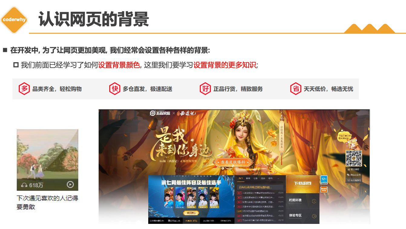
三. 背景设置
3.1. background-image
3.2. background-repeat
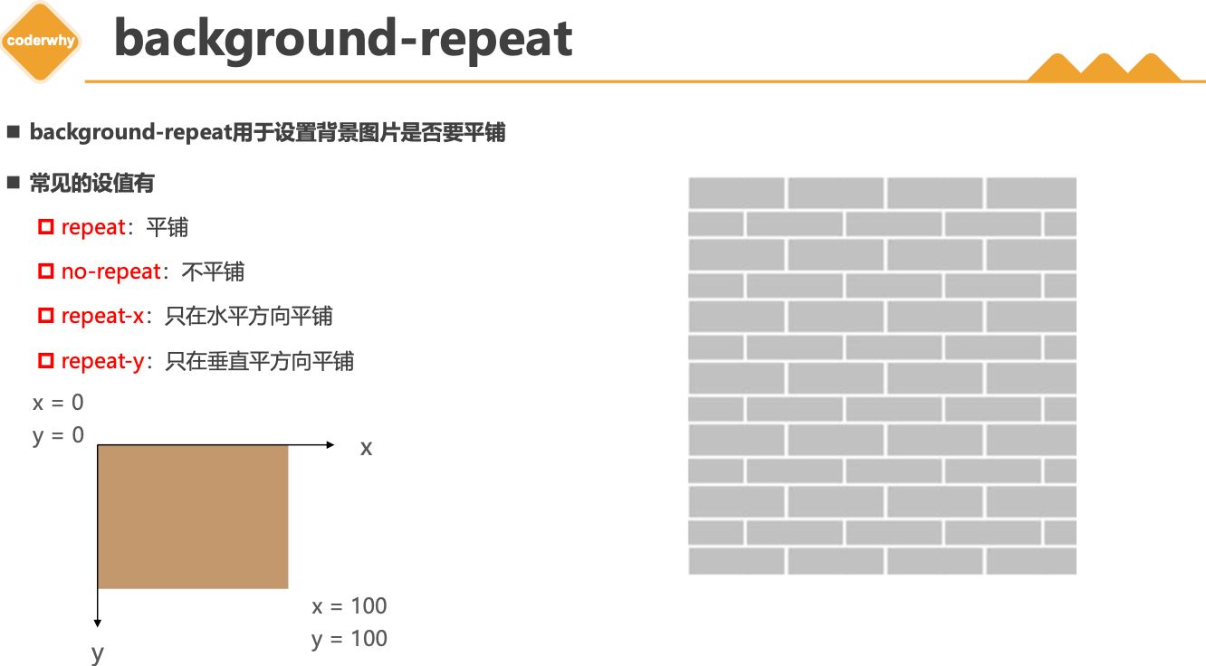
background-repeat 用于设置背景图片是否要平铺- 常见的设值有
repeat:平铺no-repeat:不平铺repeat-x:只在水平方向平铺repeat-y:只在垂直平方向平铺
3.3. background-size
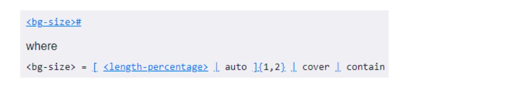
background-size 用于设置背景图片的大小
auto:默认值, 以背景图本身大小显示cover:缩放背景图,以完全覆盖铺满元素,可能背景图片部分看不见contain:缩放背景图,宽度或者高度铺满元素,但是图片保持宽高比<percentage>:百分比,相对于背景区(background positioning area)length:具体的大小,比如100px
3.4. background-position
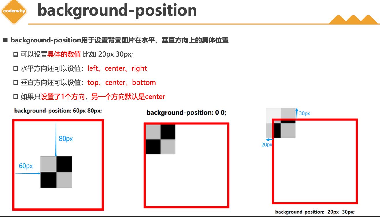
background-position 用于设置背景图片在水平、垂直方向上的具体位置
- 可以设置
具体的数值 比如 20px 30px;
- 水平方向还可以设值:
left、center、right
- 垂直方向还可以设值:
top、center、bottom
- 如果只
设置了1个方向,另一个方向默认是center
3.5. background-attachment
background-attachment决定背景图像的位置是在视口内固定,或者随着包含它的区块滚动。- 可以设置以下3个值
scroll:此关键属性值表示背景相对于元素本身固定, 而不是随着它的内容滚动local:此关键属性值表示背景相对于元素的内容固定。如果一个元素拥有滚动机制,背景将会随着元素的内容滚动.fixed:此关键属性值表示背景相对于视口固定。即使一个元素拥有滚动机制,背景也不会随着元素的内容滚动。
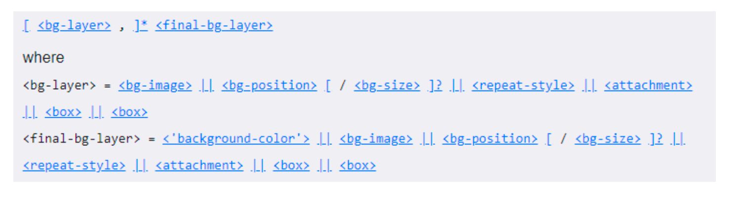
3.6. background
background是一系列背景相关属性的简写属性
3.7. background-image和img区别和选择
- 利用
background-image 和 img 都能够实现显示图片的需求,在开发中该如何选择?
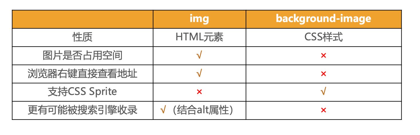
- 总结
img,作为网页内容的重要组成部分,比如广告图片、LOGO图片、文章配图、产品图片background-image,可有可无。有,能让网页更加美观。无,也不影响用户获取完整的网页内容信息


![KubeEdge | [进阶] KubeEdge高可用环境搭建](https://img.onmicrosoft.cn/ke/202305180000661.png)