打卡作业
1
2
3
4
5
6
7
8
9
10
11
12
13
14
15
16
17
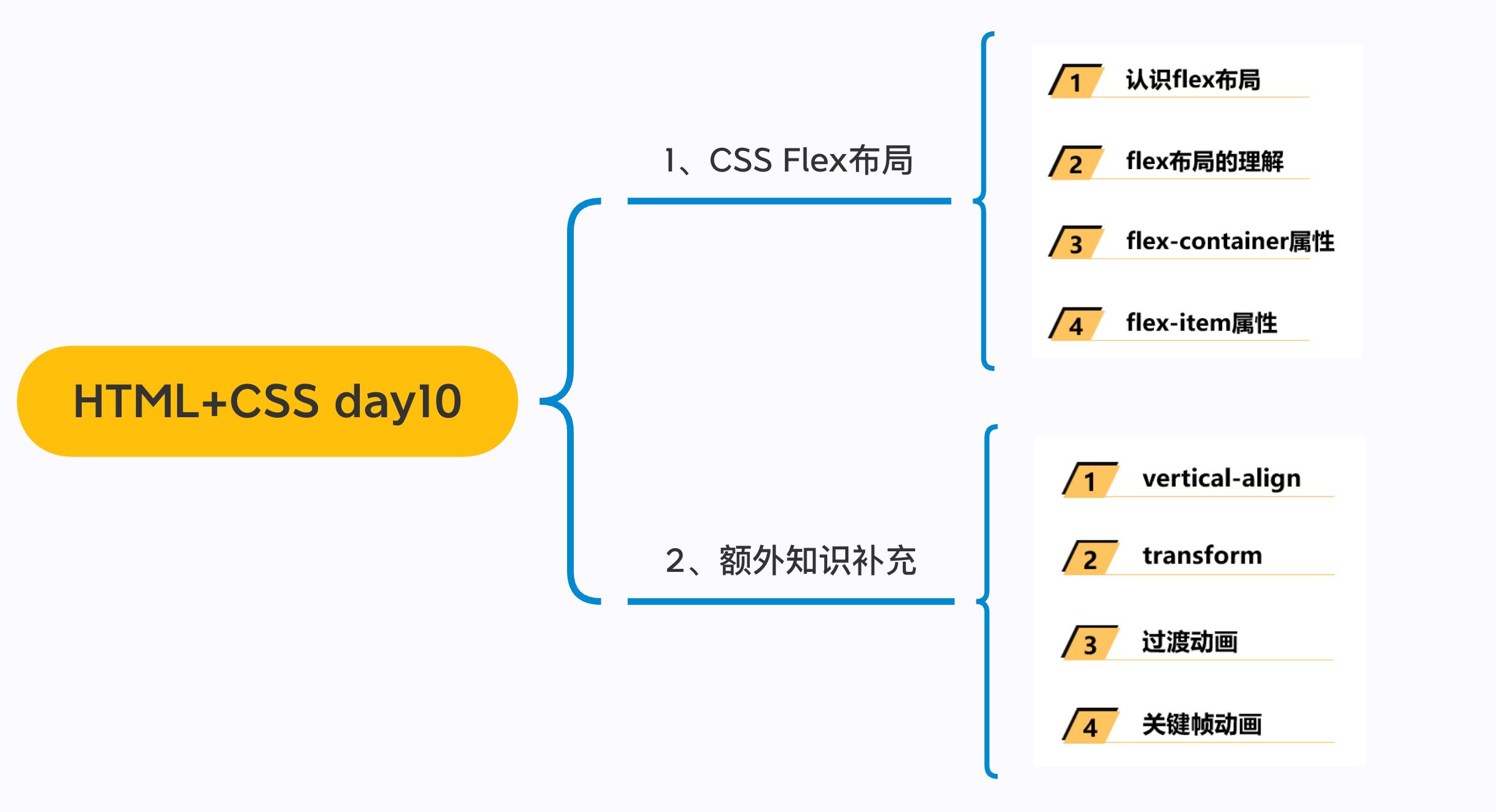
| # Day10 作业布置
## 一. 完成课堂所有的代码
* 边框可以不做
## 二. 说出为什么需要清除浮动以及如何清除浮动
## 三. 利用浮动完成如下布局结构(完成结构即可)(选做)

## 五. 自己找3个案例练习
* 案例一:其中用到元素定位
* 案例二:其中用到浮动布局
* 案例三:其中用到flex布局
|
Day09 作业布置
一. 完成课堂所有的代码
二. 总结绝对定位的相对元素以及常见的解决方案
三. 总结浮动常见的规则内容
四. 通过浮动练习页面布局方案
1
2
3
4
5
6
7
8
9
10
11
12
13
14
15
16
17
18
19
20
21
22
23
24
25
26
27
28
29
30
31
32
33
34
35
36
37
38
39
40
41
42
43
44
45
46
47
48
49
50
51
52
53
54
55
56
57
58
59
60
61
62
63
64
65
66
67
68
69
70
71
72
73
74
75
76
77
78
79
80
81
82
83
84
85
86
87
88
89
90
91
92
93
94
95
96
97
98
99
100
101
102
103
104
105
106
107
108
109
110
111
112
113
114
115
116
117
118
119
120
121
122
123
124
125
126
127
128
129
130
131
132
133
134
135
136
137
138
139
140
141
142
143
144
145
146
147
148
149
150
151
152
153
154
155
156
157
158
159
160
161
162
163
164
165
166
167
168
169
170
171
172
173
174
175
176
177
178
179
180
181
182
183
184
185
186
187
188
189
190
191
192
193
194
195
196
197
198
199
200
201
202
203
204
205
206
| <!DOCTYPE html>
<html lang="en">
<head>
<meta charset="UTF-8">
<meta http-equiv="X-UA-Compatible" content="IE=edge">
<meta name="viewport" content="width=device-width, initial-scale=1.0">
<title>Document</title>
<link rel="stylesheet" href="./reset.css">
<style>
.content {
width: 1211px;
margin: 0 auto;
height: 1000px;
}
.wrapper {
margin-right: -10px;
}
.item {
float: left;
width: 234px;
margin-bottom: 10px;
margin-right: 10px;
}
.item.left {
height: 614px;
background-image: url(../images/小米01.webp);
}
.item.right {
height: 302px;
}
.items {
background-color: #fff;
display: block;
width: 234px;
height: 302px;
text-align: center;
box-sizing: border-box;
}
.items:hover {
box-shadow: 0 2px 20px 5px rgba(0, 0, 0, .1)
}
.items img {
width: 160px;
height: 160px;
}
.items .title {
margin-top: 14px;
color: #333;
}
.items .desc {
color: rgb(105, 97, 97);
margin-top: 8px;
white-space: nowrap;
overflow: hidden;
text-overflow: ellipsis;
}
.items .price {
margin-top: 14px;
font-size: 14px;
}
.items .new-price {
color: #ff6700;
}
.items .old-price {
color: #999;
text-decoration: line-through;
margin-left: 5px;
}
</style>
</head>
<body>
<div class="content">
<div class="wrapper">
<div class="item left"></div>
<div class="item right">
<a class="items" href="https://www.mi.com/xiaomipad5pro" target="_blank">
<img src="../images/xiaomi01.webp" alt="">
<h3 class="title">小米平板5 Pro</h3>
<p class="desc">
全新12代英特尔处理器,CNC一体精雕工艺,2.5K 120Hz高清屏,可选MX550独立显卡
</p>
<div class="price">
<span class="new-price">2399元起</span>
<span class="old-price">2499元</span>
</div>
</a>
</div>
</div>
</div>
</body>
</html>
|
五. 完成下面的案例练习
1
2
3
4
5
6
7
8
9
10
11
12
13
14
15
16
17
18
19
20
21
22
23
24
25
26
27
28
29
30
31
32
33
34
35
36
37
38
39
40
41
42
43
44
45
46
47
48
49
50
51
52
53
54
55
56
57
58
59
60
61
62
63
64
65
66
67
68
69
70
71
72
73
74
75
76
77
78
79
80
81
82
83
84
85
86
87
88
89
90
91
92
93
94
95
96
97
98
99
100
101
102
103
104
105
106
107
108
109
110
111
112
| <!DOCTYPE html>
<html lang="en">
<head>
<meta charset="UTF-8">
<meta http-equiv="X-UA-Compatible" content="IE=edge">
<meta name="viewport" content="width=device-width, initial-scale=1.0">
<title>Document</title>
<link rel="icon " href="../icon/iconfont.ttf">
<link rel="stylesheet" href="../icon/iconfont.css">
<style>
a,
i {
text-decoration: none;
color: #333;
}
.content {
width: 275px;
margin: 0 auto;
}
.content .item {
display: block;
position: relative;
border-radius: 6px;
overflow: hidden;
}
.content .item img {
width: 275px;
height: 154px;
vertical-align: top;
}
.item .bottom {
position: absolute;
left: 0;
right: 0;
bottom: 0;
height: 27px;
line-height: 27px;
font-size: 12px;
color: #fff;
}
.bottom .icons {
position: relative;
top: 1px;
padding-left: 8px;
color: #fff;
}
.bottom .icon_middle {
padding-left: 10px;
color: #fff;
}
.bottom .icon_right {
position: absolute;
right: 10px;
}
.text_bottom {
display: block;
margin: 8px 0;
font-weight: 700;
}
.up {
color: rgb(172, 163, 163);
}
.icon_up {
position: relative;
top: 1px;
font-size: 16px;
color: rgb(172, 163, 163);
}
.up>span {
font-size: 14px;
}
</style>
</head>
<body>
<div class="content">
<a class="item" href="">
<img src="../images/bilibili.webp" alt="">
<div class="bottom">
<i class="iconfont icons">
</i>
<span class="icon_left">33.6万</span>
<i class="iconfont icon_middle">󰆸</i>
<span class="icon_midle">3.4万</span>
<span class="icon_right">01:50:38</span>
</div>
</a>
<span class="text_bottom">三个视频看懂汉武帝的一生:汉匈决战来临</span>
<div class="up">
<i class="iconfont icon_up"></i>
<span>唠点历史</span>
<span>3-30</span>
</div>
</div>
</body>
</html>
|
务必下载!!
今日的代码和讲义 以及思维导图:【点击此链接下载 Day10.zip】
大纲
一. 浮动float
1.1. 两个案例
浮动练习三
1
2
3
4
5
6
7
8
9
10
11
12
13
14
15
16
17
18
19
20
21
22
23
24
25
26
27
28
29
30
31
32
33
34
35
36
37
38
39
40
41
42
43
44
45
46
47
48
49
50
51
52
53
54
55
56
57
58
59
60
61
62
63
64
65
66
67
68
| <!DOCTYPE html>
<html lang="en">
<head>
<meta charset="UTF-8">
<meta http-equiv="X-UA-Compatible" content="IE=edge">
<meta name="viewport" content="width=device-width, initial-scale=1.0">
<title>Document</title>
<style>
.content {
width: 1190px;
margin: 0 auto;
background-color: #f00;
height: 1000px;
}
.wrapper {
margin-right: -10px;
}
.item {
width: 290px;
background-color: purple;
margin-bottom: 10px;
float: left;
margin-right: 10px;
}
.item.left {
height: 370px;
}
.item.right {
height: 180px;
}
</style>
</head>
<body>
<div class="content">
<div class="wrapper">
<div class="item left"></div>
<div class="item left"></div>
<div class="item right"></div>
<div class="item right"></div>
<div class="item right"></div>
<div class="item right"></div>
<div class="item right"></div>
<div class="item right"></div>
<div class="item right"></div>
<div class="item right"></div>
<div class="item right"></div>
<div class="item right"></div>
<div class="item right"></div>
<div class="item right"></div>
<div class="item right"></div>
<div class="item right"></div>
<div class="item right"></div>
<div class="item right"></div>
<div class="item right"></div>
<div class="item right"></div>
<div class="item right"></div>
<div class="item right"></div>
</div>
</div>
</body>
</html>
|
浮动练习四
1
2
3
4
5
6
7
8
9
10
11
12
13
14
15
16
17
18
19
20
21
22
23
24
25
26
27
28
29
30
31
32
33
34
35
36
37
38
39
40
41
42
43
44
45
46
47
48
49
50
51
52
| <!DOCTYPE html>
<html lang="en">
<head>
<meta charset="UTF-8">
<meta http-equiv="X-UA-Compatible" content="IE=edge">
<meta name="viewport" content="width=device-width, initial-scale=1.0">
<title>Document</title>
<style>
.content {
width: 1100px;
margin: 0 auto;
height: 800px;
background: #ccc;
}
.box {
}
.item {
width: 221px;
height: 168px;
background: orange;
color: #fff;
float: left;
border: 1px solid #000;
margin-right: -1px;
box-sizing: border-box;
}
.item.first {
width: 220px;
}
</style>
</head>
<body>
<div class="content">
<div class="box">
<div class="item first">1</div>
<div class="item">2</div>
<div class="item">3</div>
<div class="item">4</div>
<div class="item">5</div>
</div>
</div>
</body>
</html>
|
1.2. 清除浮动
浮动的问题 – 高度塌陷
- 由于浮动元素脱离了标准流,变成了脱标元素,所以
不再向父元素汇报高度
- 父元素
计算总高度时,就不会计算浮动子元素的高度,导致了高度坍塌的问题
- 解决父元素高度坍塌问题的过程,一般叫做清浮动(清理浮动、清除浮动)
- 清浮动的目的是
- 让
父元素计算总高度的时候,把浮动子元素的高度算进去
- 如何清除浮动呢? 使用
clear属性
CSS属性 - clear
clear属性是做什么的呢?
clear 属性可以指定一个元素是否必须移动(清除浮动后)到在它之前的浮动元素下面;
clear的常用取值
left:要求元素的顶部低于之前生成的所有左浮动元素的底部right:要求元素的顶部低于之前生成的所有右浮动元素的底部both:要求元素的顶部低于之前生成的所有浮动元素的底部none:默认值,无特殊要求
- 那么我们可以利用这个特性来清除浮动.
清除浮动的方法
- 事实上我们有很多方法可以清除浮动
- 方法一: 给父元素设置固定高度
- 方法二: 在父元素最后增加一个空的块级子元素,并且让它设置
clear: both
- 会
增加很多无意义的空标签,维护麻烦
- 违反了结构与样式分离的原则(不推荐)
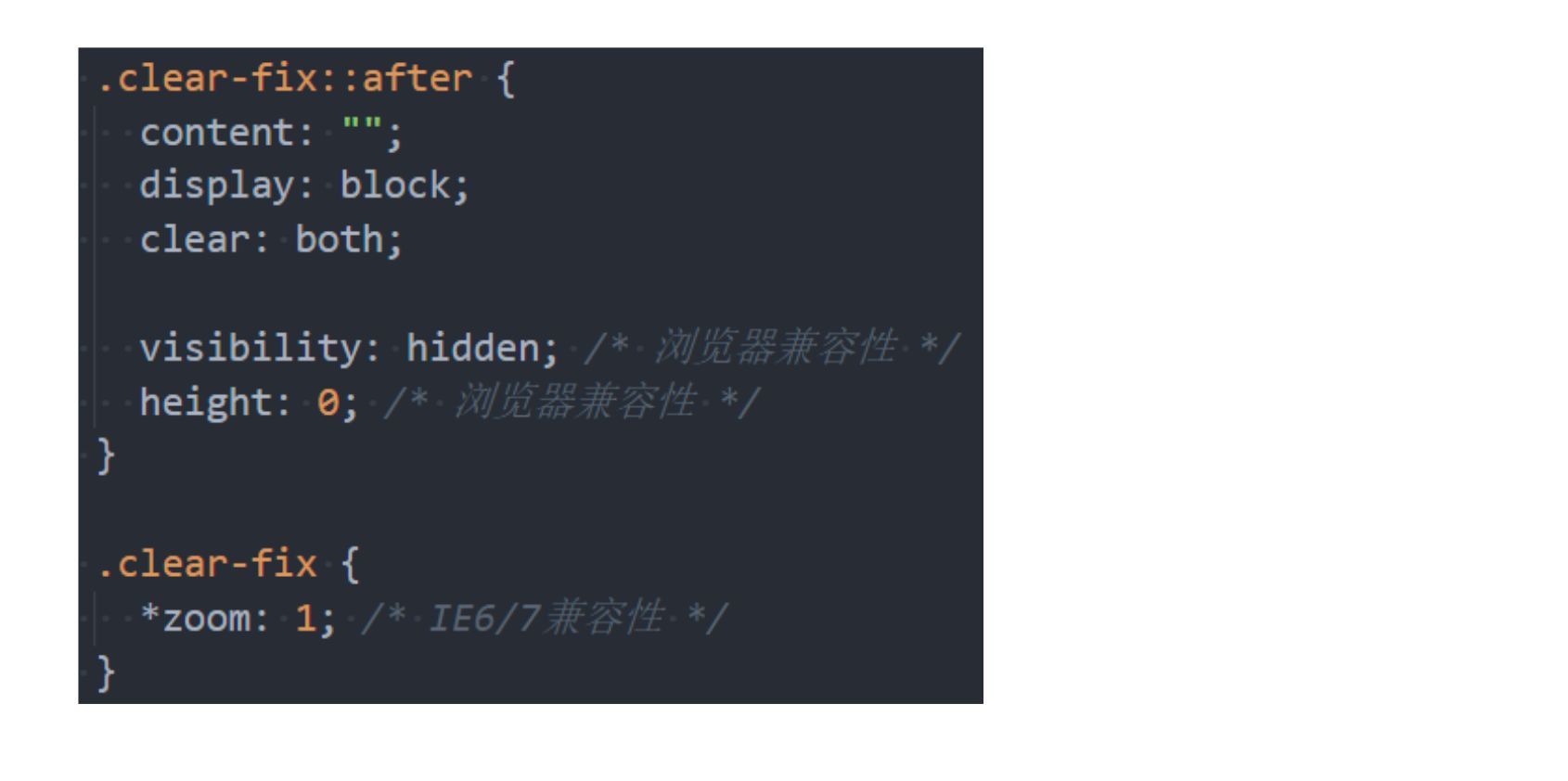
- 方法三: 给父元素添加一个伪元素
方法三 – 伪元素清除浮动
1
2
3
4
5
6
7
8
9
|
.clearfix:after{
content: '';
display: block;
clear: both;
visibility: hidden;
height: 0;
}
|
1.3. 多种布局对比
二. flex布局
2.1. 认识flex布局
认识flexbox
- Flexbox翻译为弹性盒子:
弹性盒子是一种用于按行或按列布局元素的一维布局方法 ;- 元素可以
膨胀以填充额外的空间, 收缩以适应更小的空间;
- 通常我们使用Flexbox来进行布局的方案称之为
flex布局(flex layout);
- flex布局是目前web开发中使用最多的布局方案:
- flex 布局(Flexible 布局,弹性布局);
- 目前特别在
移动端可以说已经完全普及;
- 在
PC端也几乎已经完全普及和使用, 只有非常少数的网站依然在用浮动来布局;
- 为什么需要flex布局呢?
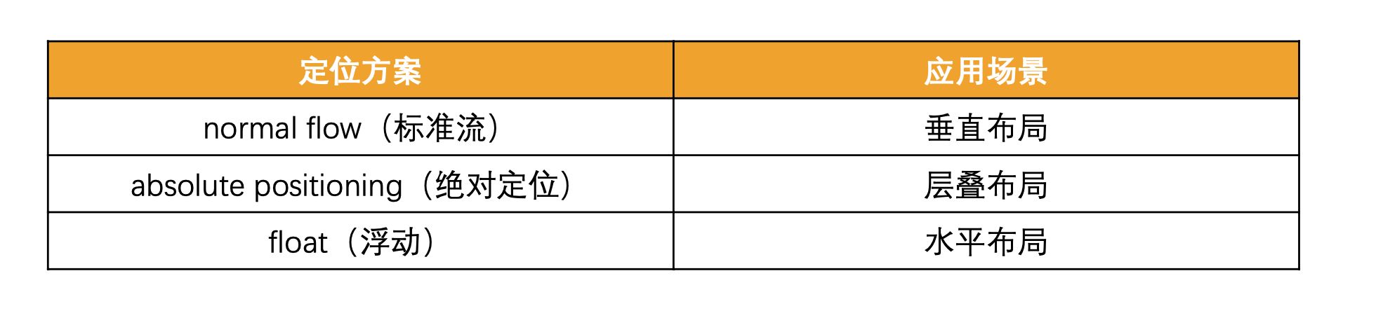
- 长久以来,CSS 布局中唯一可靠且跨浏览器兼容的
布局工具只有 floats 和 positioning。
- 但是这两种方法本身
存在很大的局限性, 并且他们用于布局实在是无奈之举;
原先的布局存在的痛点
flex布局的出现
- 所以长久以来, 大家非常期待一种真正可以用于对元素布局的方案: 于是flex布局出现了;
- Nature and nature’s laws lay hid in night; God said “Let
Newton be” and all was light.
- 自然与自然的法则在黑夜隐藏,于是上帝说,让
牛顿出现吧!于是世界就明亮了起来.
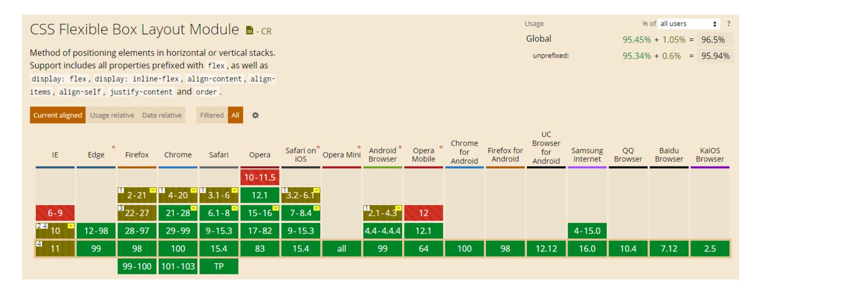
- flexbox在使用时, 我们最担心的是它的兼容性问题:
2.2. flex布局重要的概念
1
2
3
4
| * flex container
* flex item
* main axis/cross axios
* main start/main end/cross start / cross end
|
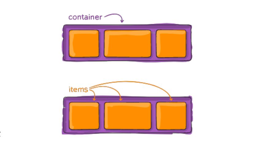
- 两个重要的概念:
- 开启了 flex 布局的元素叫
flex container
- flex container 里面的直接子元素叫做
flex item
- 当flex container中的子元素变成了flex item时, 具备一下特点:
- flex item的布局将
受flex container属性的设置来进行控制和布局;
- flex item
不再严格区分块级元素和行内级元素;
- flex item
默认情况下是包裹内容的, 但是可以设置宽度和高度;
- 设置 display 属性为 flex 或者 inline-flex 可以成为 flex container
flex: flex container 以 block-level 形式存在inline-flex: flex container 以 inline-level 形式存在
flex布局的模型
2.3. flex container中的属性
1
2
3
4
5
6
7
8
9
| ◼ 应用在 flex container 上的 CSS 属性
* flex-flow * flex-direction
* flex-wrap * flex-flow
* justify-content * align-items
* align-content
◼ 应用在 flex items 上的 CSS 属性
* flex-grow * flex-basis
* flex-shrink * order
* align-self * flex
|
flex-direction
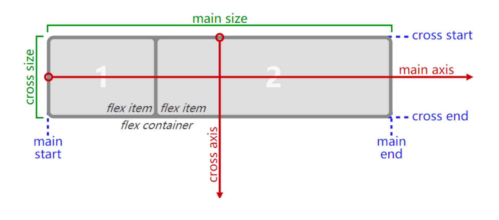
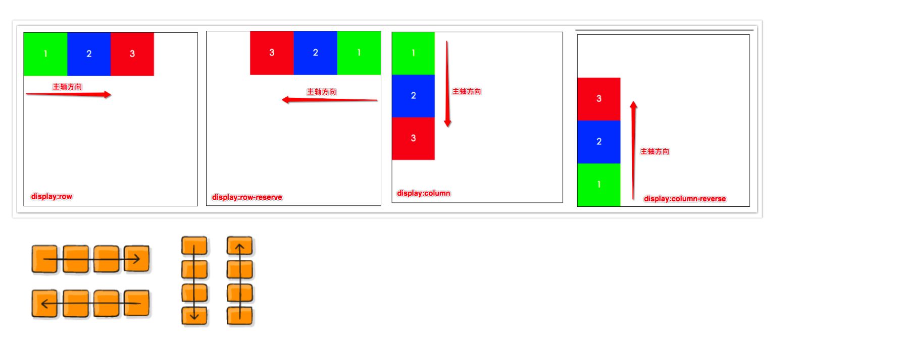
- flex items 默认都是沿着 main axis(主轴)从 main start 开始往 main end 方向排布
flex-direction 决定了 main axis 的方向,有 4 个取值row(默认值)、row-reverse、column、column-reverse
flex-wrap
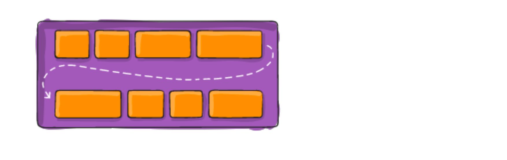
- flex-wrap 决定了 flex container 是单行还是多行
nowrap(默认):单行wrap:多行wrap-reverse:多行(对比 wrap,cross start 与 cross end 相反)
flex-flow
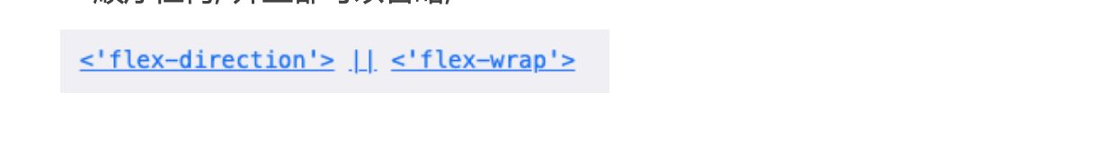
flex-flow 属性是 flex-direction 和 flex-wrap 的简写。
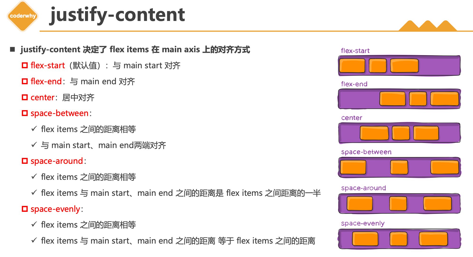
justify-content
- justify-content 决定了 flex items 在 main axis 上的对齐方式
flex-start(默认值):与 main start 对齐flex-end:与 main end 对齐center:居中对齐space-between:
✓ flex items 之间的距离相等
✓ 与 main start、main end两端对齐space-around:
✓ flex items 之间的距离相等
✓ flex items 与 main start、main end 之间的距离是 flex items 之间距离的一半space-evenly:
✓ flex items 之间的距离相等
✓ flex items 与 main start、main end 之间的距离 等于 flex items 之间的距离
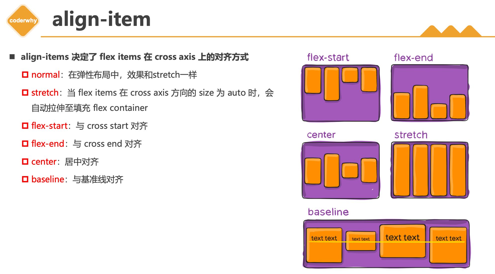
align-item
- align-items 决定了 flex items 在 cross axis 上的对齐方式
normal:在弹性布局中,效果和stretch一样stretch:当 flex items 在 cross axis 方向的 size 为 auto 时,会 自动拉伸至填充 flex containerflex-start:与 cross start 对齐flex-end:与 cross end 对齐 center:居中对齐baseline:与基准线对齐
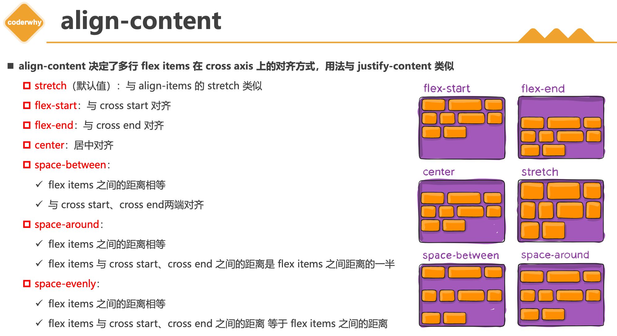
align-content
- align-content 决定了多行 flex items 在 cross axis 上的对齐方式,用法与 justify-content 类似
stretch(默认值):与 align-items 的 stretch 类似flex-start:与 cross start 对齐flex-end:与 cross end 对齐center:居中对齐space-between:
✓ flex items 之间的距离相等
✓ 与 cross start、cross end两端对齐space-around:
✓ flex items 之间的距离相等
✓ flex items 与 cross start、cross end 之间的距离是 flex items 之间距离的一半space-evenly:
✓ flex items 之间的距离相等
✓ flex items 与 cross start、cross end 之间的距离 等于 flex items 之间的距离
2.4. flex item中的属性
1
2
3
| * order * align-self
* flex-grow * flex-shrink
* flex-basis * flex
|
flex-item属性 - order
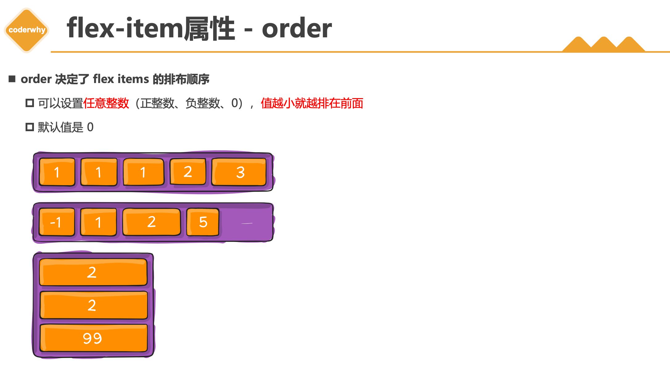
- order 决定了 flex items 的排布顺序
- 可以设置
任意整数(正整数、负整数、0),值越小就越排在前面
- 默认值是 0
flex-item属性 - flex items
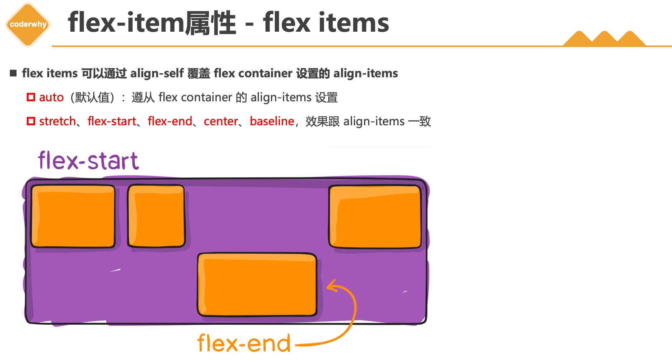
- flex items 可以通过 align-self 覆盖 flex container 设置的 align-items
auto(默认值):遵从 flex container 的 align-items 设置stretch、flex-start、flex-end、center、baseline,效果跟 align-items 一致
flex-item属性 - flex-grow
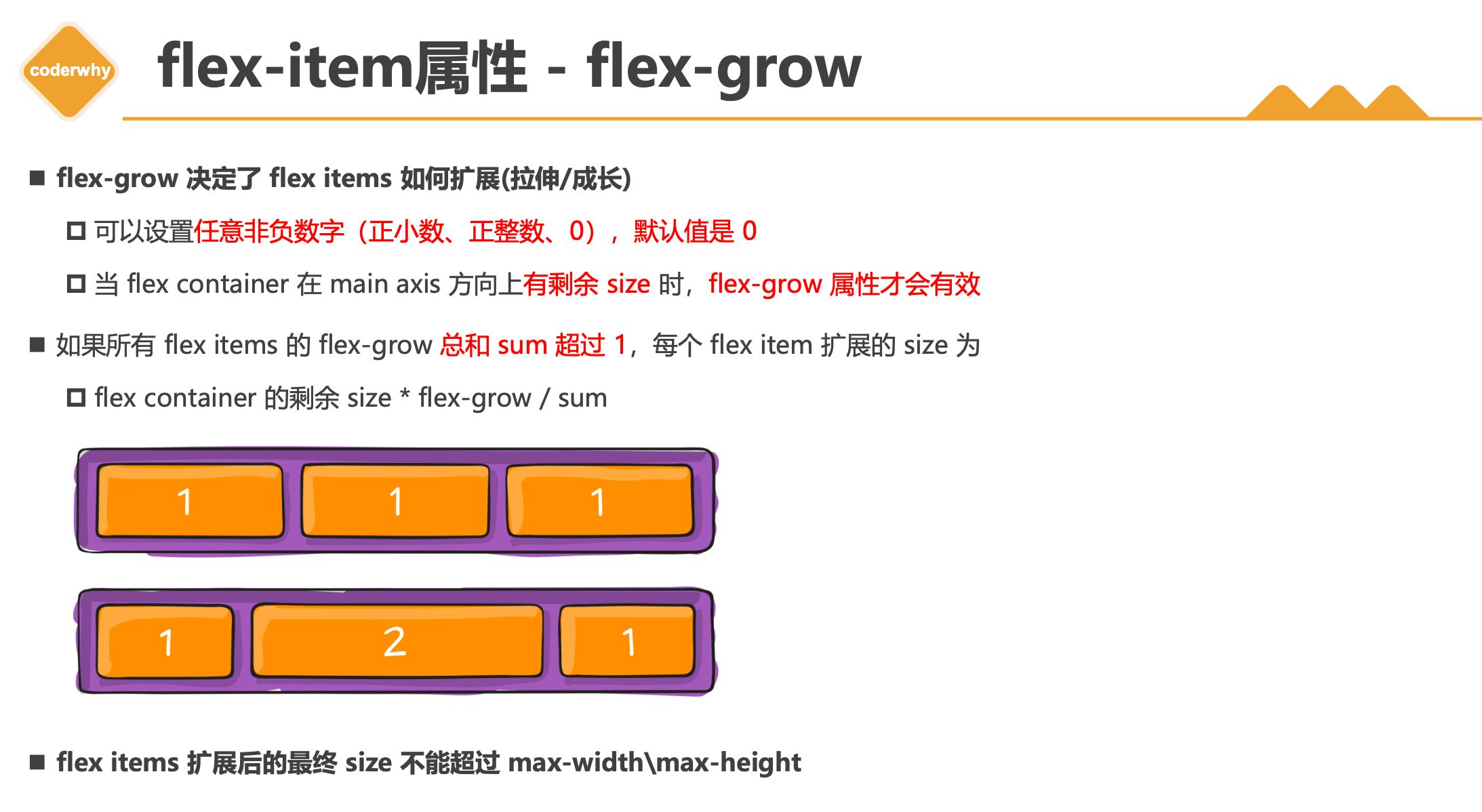
flex-grow 决定了 flex items 如何扩展(拉伸/成长)
- 可以设置
任意非负数字(正小数、正整数、0),默认值是 0
- 当 flex container 在 main axis 方向上
有剩余 size 时,flex-grow 属性才会有效
如果所有 flex items 的 flex-grow 总和 sum 超过 1,每个 flex item 扩展的 size 为
- flex container 的剩余 size * flex-grow / sum
flex items 扩展后的最终 size 不能超过 max-width\max-height
flex-item属性 - flex-shrink
- flex-shrink 决定了 flex items 如何收缩(缩小)
- 可以设置
任意非负数字(正小数、正整数、0),默认值是 1
- 当 flex items 在 main axis 方向上
超过了 flex container 的 size,flex-shrink 属性才会有效
- 如果所有 flex items 的 flex-shrink 总和超过 1,每个 flex item 收缩的 size为
- flex items 超出 flex container 的 size * 收缩比例 / 所有 flex items 的收缩比例之和
- flex items 收缩后的最终
size 不能小于 min-width\min-height
flex-item属性 - flex-basis
- flex-basis 用来设置 flex items 在 main axis 方向上的 base size
- 决定 flex items 最终 base size 的因素,从优先级高到低
- max-width\max-height\min-width\min-height
- flex-basis
- width\height
- 内容本身的 size
flex-item属性 - flex属性
- flex 是 flex-grow || flex-shrink || flex-basis 的简写,flex 属性可以指定1个,2个或3个值。

2.5. flex布局中justify-content最后一行布局问题


![KubeEdge | [进阶] KubeEdge高可用环境搭建](https://img.onmicrosoft.cn/ke/202305180000661.png)